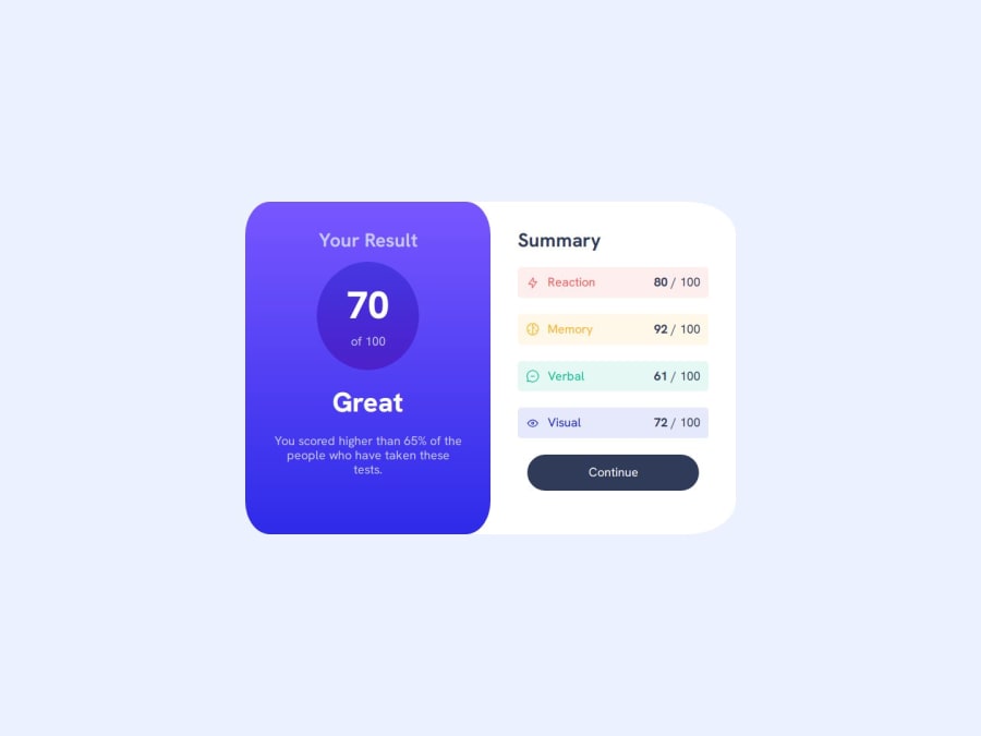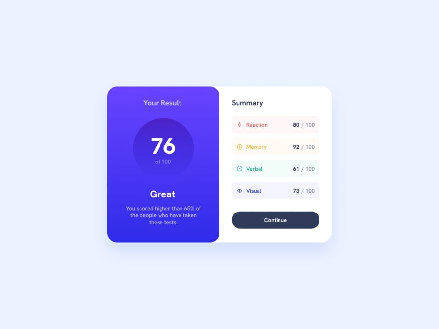
Design comparison
Solution retrospective
I'm learning some new things like using rem em for responsive
What specific areas of your project would you like help with?I need advice about
if the way that I do responsive typography good or bad practice or there is a more efficient way
Community feedback
- @R3ygoskiPosted 12 months ago
Hello @bennahiaoualid, congratulations on completing your project! It looks really good, very similar to the proposed design.
Regarding your question, the way you used it is not wrong at all, it's actually very good. Using
clamp()makes the font much more responsive and is the best approach for that. So, yes, you are on the right track, congratulations.Your HTML is very well structured and semantic, my sincere congratulations. Keep practicing and improving. If you have any questions, please ask below, and I'll try to help as best as I can.
0
Please log in to post a comment
Log in with GitHubJoin our Discord community
Join thousands of Frontend Mentor community members taking the challenges, sharing resources, helping each other, and chatting about all things front-end!
Join our Discord
