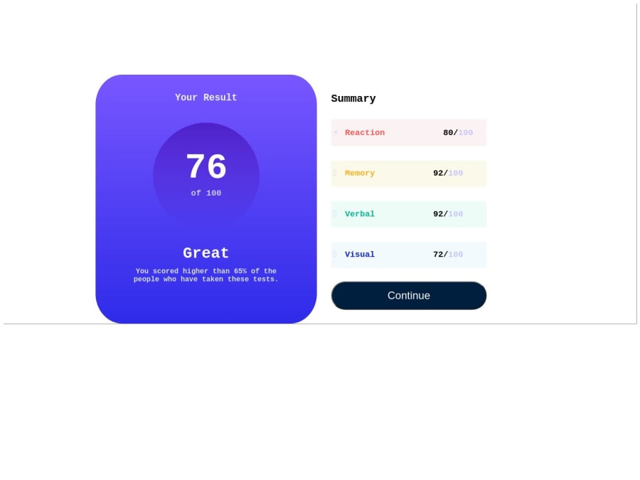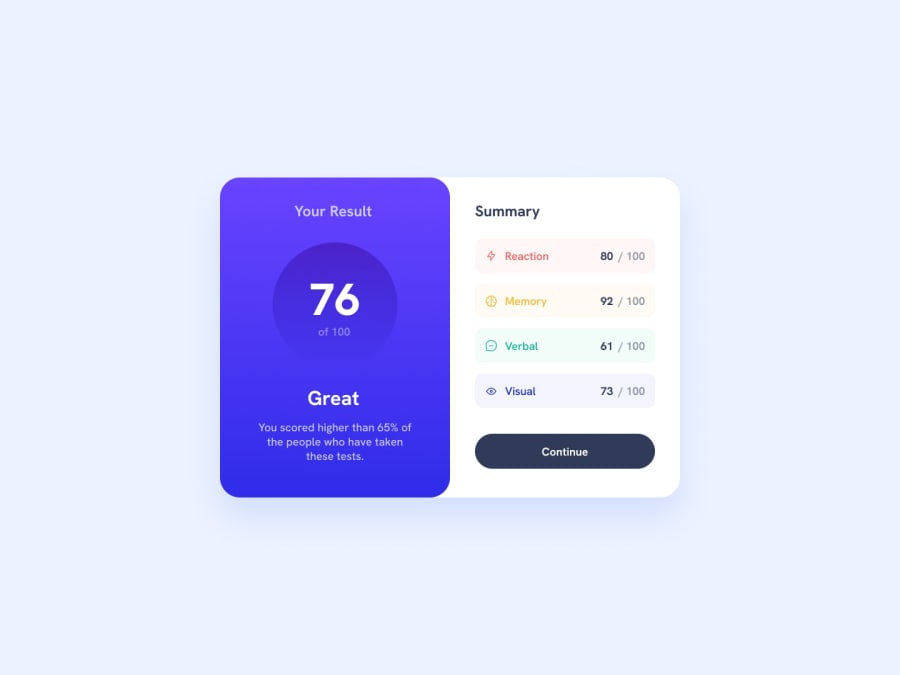
Design comparison
Solution retrospective
I am new to programming and I might be a bit of a slow learner. I believe the only way to truly learn is by doing, so I have decided to do a little bit more doing instead of only learning.
I knew my solution would not be the best. I just wanted to get my hands on the keyboard and do some projects and make an attempt to at least get it to look like the design I was shown.
I still have a lot to learn and a lot of practicing to do. I don't seem to have a good grasp on the basics. I used margins, and flexbox, just buy guessing and trying to get it to look at least like the desktop design.
Searching things on the web have assisted me with that approach.
Some of the main resources that people use, such as "Font-awesome" is blocked where I am located now(China) so I had to search the web to find other resources for things such as icons, etc.
I will do better on my next project.
Community feedback
Please log in to post a comment
Log in with GitHubJoin our Discord community
Join thousands of Frontend Mentor community members taking the challenges, sharing resources, helping each other, and chatting about all things front-end!
Join our Discord
