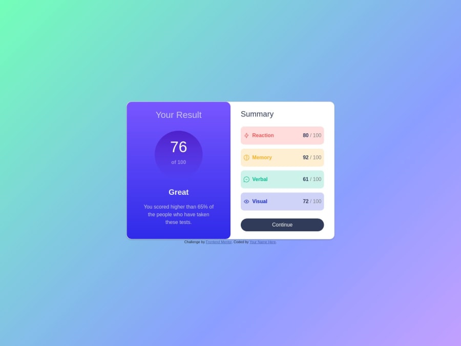
Design comparison
Solution retrospective
I thought it was an easy challenge, but it took me quite a while to achieve the final result. There were some small issues with the layout and styles. I had to make several different approaches to the result. I did some reseaches and examples over the internet. I finally found a similar design that I could reference to. There are many techniques and skills that I can apply to my future projects. ps: I found there is a line of border around the left column. I haven't figure out where it went wrong. Let me know if you know how to fix it. Thanks!
Community feedback
- @impiiaPosted over 1 year ago
Hello! You've done a great job! Regarding the white line of border around the left column, you are using Bootstrap, which already has some styles. You are using the card class <div class="card">, and Bootstrap has a class called .card which already applies some styles, including the border around the left column (--bs-card-border-width: var(--bs-border-width);). In your code, you are overriding the .card class, but the styles applied by Bootstrap remain. To resolve this, change the name of your class to something else (for example, "my-card" in both the HTML and CSS), and the white line around the left column will disappear.
2 - @thomashertogPosted over 1 year ago
The visual is looking good. There are some improvements available on the code part though
HTML
- the headings are not hidden
- headings and their levels should be in order and still make sense (imagine stripping out all the other content, does it look like a sensible table of contents?)
- there should only be 1
<h1> - you have a
<div class="score-list">with<div class="list-item">, which is completely insemantic. Use a<ul>with<li>for this - the
<button>does not have atypeattribute
CSS
- you've included bootstrap, but i don't really see it being used (and it's making things harder to adjust)
- it's not responsive (not down to
375pxat least, like in the challenge requirements) - i've got a feeling that a lot of styling is already in the HTML which made it more complex than it should be, keeping your CSS smaller (which i don't necessarily think is a good thing either)
P.S. the border around the left column is coming from the
borderproperty in your.cardselector (probably coming from bootstrap)0 - @redoncapuni17Posted over 1 year ago
Well done for finishing the challenge
As a front-end developer, your job is to make the website look just like the designer wants it to. If there are any differences, try to fix them quickly so that the website matches the design as soon as possible.
This challenge consists of two parts: the mobile component and the desktop component. However, it appears that the mobile part has not been developed. It's important to address this issue and ensure that both the mobile and desktop aspects of the challenge are completed.
1. Lack of semantic HTML:
- Semantic HTML elements are missing or not used appropriately.
- The structure does not convey the meaning and purpose of different parts of the webpage.
2. Usage of absolute units instead of relative units:
- Absolute units like pixels (px) are used for defining lengths and sizes instead of relative units like percentages (%), em, or rem.
- Relative units are more flexible and responsive across different screen sizes.
I hope you find this helpful and happy coding
0
Please log in to post a comment
Log in with GitHubJoin our Discord community
Join thousands of Frontend Mentor community members taking the challenges, sharing resources, helping each other, and chatting about all things front-end!
Join our Discord
