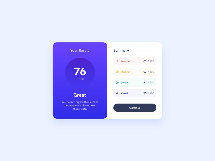
Design comparison
Solution retrospective
Why couldn't I align the "summary" to the left?
Community feedback
- @4LastBreathPosted over 1 year ago
Hi again @ivan-josef, you improved. 🖖 You can't align 'summary' to the left because of your align-item:center on your class 'half'. I also noticed that you used padding or margin on every element to space them inside your flexbox. You can do it a much easier way, just use the "justify-content: space-between" (it's gonna push element at both ends of your half class), or the gap property if you want to choose precisely the space between every element of your flexbox. You'll need some padding on your right half element if you do this. And you used a span for the button 'continue', change it to button in your html.
That's how you can align 'summary' to the left and keep your flexbox
.half {
    width: 50%;
    display: flex;
    flex-direction: column;
    align-items: center;
    justify-content: space-between;
    padding: (your padding);
}

.half:last-child > h3 {
   width: 100%; (if it take all width, it's gonna avoid the align-item:center)
   text-align: left;

  or

  margin: 0 auto 0 0; (with margin auto to the right, it's gonna push it to the left)
}
Marked as helpful0
Please log in to post a comment
Log in with GitHubJoin our Discord community
Join thousands of Frontend Mentor community members taking the challenges, sharing resources, helping each other, and chatting about all things front-end!
Join our Discord
