Design comparison
SolutionDesign
Community feedback
- @Saad-HishamPosted over 1 year ago
Hey there!
Your solution is almost perfect✨ I just wanted to give you a few tips on how to make it even better.
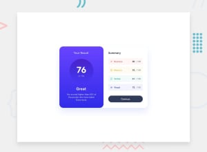
Firstly, it seems like you may have forgotten to add images before the summary section elements. Adding images can help make the page more visually engaging and provide context for the content.
Secondly, consider adding a hover effect to the button to make it clear that it's clickable. You can use this code:
button.btn {
    cursor: pointer;
    border: none;
}
button.btn:hover{
    background: rgb(103,67,255);
    background: linear-gradient(180deg, rgba(103,67,255,1) 34%, rgba(49,44,235,1) 100%);
}
Lastly, the design seems to break on mobile screens. Consider using media queries to adjust the design for smaller screens.
@media only screen and (max-width: 768px) {
    /* Styles for mobile devices go here */
}
Keep up the great work🔥
0
Please log in to post a comment
Log in with GitHubJoin our Discord community
Join thousands of Frontend Mentor community members taking the challenges, sharing resources, helping each other, and chatting about all things front-end!
Join our Discord
