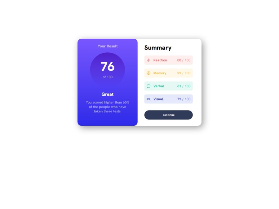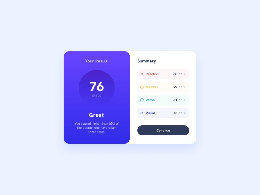
Design comparison
Solution retrospective
The challenge that I've encounter maybe is fixing the position of every content in the container.
Community feedback
- @grace-snowPosted 6 months ago
Hi, this looks pretty good but I spot some problems.
- all content should be contained within landmarks. At least add a
mainto wrap the main page content. - you need to rethink the use and order of headings here a lot. Headings are really important for conveying the structure of a page's content. Numbers make no sense as headings. In this "your results" is the primary heading for all other content. If you want "great" can be a heading but doesn't have to be. "Summary" is definitely a heading so that is correct.
- in the summary section I'd expect this to be a list or description list.
- The topics like reaction etc could even be sub headings
- make sure the scores match the design colours.
- it's better for performance to link fonts in the html head instead of css imports.
- get into the habit of including a full modern css reset at the start of the styles in every project. Look them up. This is not a full reset. Andy Bell or Josh Comeau both have good ones you can look up and use.
- font size should never be in px. Use rem. https://fedmentor.dev/posts/font-size-p.
- the component shouldn't have heights or widths. All it should have is a single max width in rem. I'm a little surprised you've not learnt that in earlier challenges honestly. You may need to go back and refactor them if you've added heights and widths in those. It's the browsers job to decide what height is needed based on the content and spacings inside. As soon as you limit height like that you've created a fragile solution that will break as soon as content changes, a user changes their text size or font styles, or a site is translated or viewed on a small screen. Instead, setting no height and only setting a rem max width creates a robust and flexible component that can shrink narrower and taller when it needs to, and that will scale correctly when people change text size settings in browser or device.
- you should be styling mobile first by now. The mobile styles should almost always be the default. Then add a min width media query to make the minor layout changes needed for larger screens. https://fedmentor.dev/posts/responsive-meaning/.
- remove the huge margins on the component default styles. That's not how you center a component on the screen. Keep margins and paddings small. To center a card on the screen make the body a flex column and min-height 100svh. At the moment these huge margins are causing very strange layouts on some screens like mobile landscape.
Marked as helpful0 - all content should be contained within landmarks. At least add a
Please log in to post a comment
Log in with GitHubJoin our Discord community
Join thousands of Frontend Mentor community members taking the challenges, sharing resources, helping each other, and chatting about all things front-end!
Join our Discord
