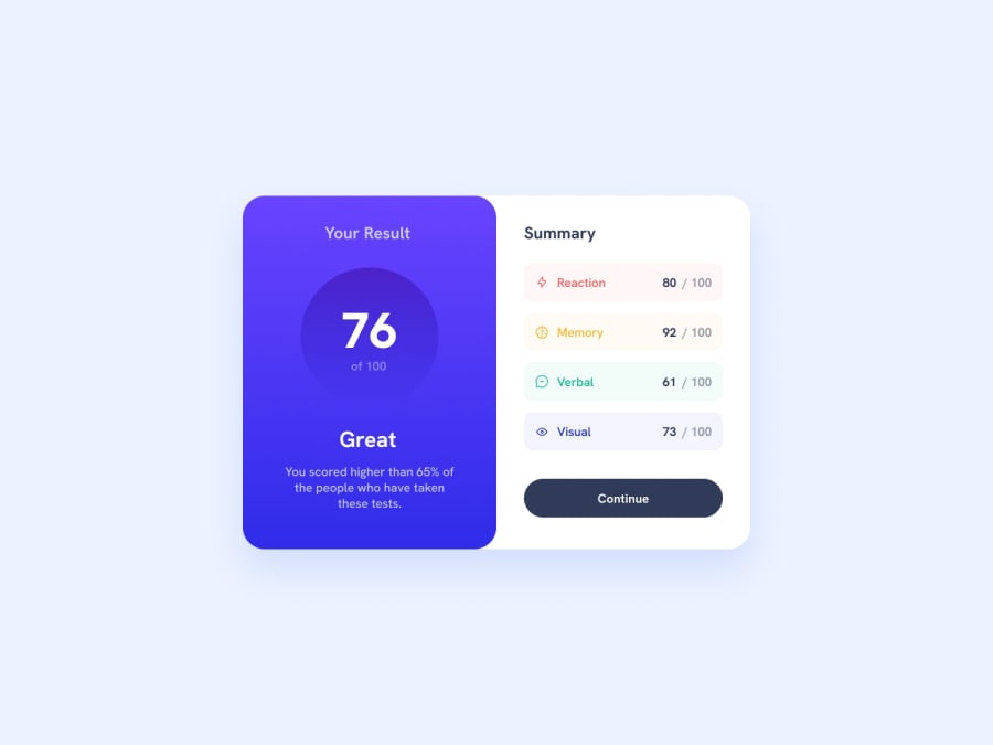
Design comparison
SolutionDesign
Solution retrospective
Even though I was able to make this solution with my HTML layout, I feel it is not efficient and could be better. I feel I use too many divs to make my layout, but I am just not sure if what I am doing is correct or if there is another way I can make things simpler why still achieving a similar result.
ex: Too many divs to lay things out
<div class="scoreBox reaction">
            <div class="topRight"></div>
            <div class="topLeft"></div>
            <div class="btmRight"></div>
            <div class="btmLeft"></div>
            <div class="titleContainer">
              <img
                src="assets/images/icon-reaction.svg"
                alt="red lightning symbol"
              />
              <div>Reaction</div>
            </div>
            <div class="scoreContainer">
              <div class="yourScore"></div>
              <div class="yourBaseScore">/ 100</div>
            </div>
</div>
Community feedback
Please log in to post a comment
Log in with GitHubJoin our Discord community
Join thousands of Frontend Mentor community members taking the challenges, sharing resources, helping each other, and chatting about all things front-end!
Join our Discord
