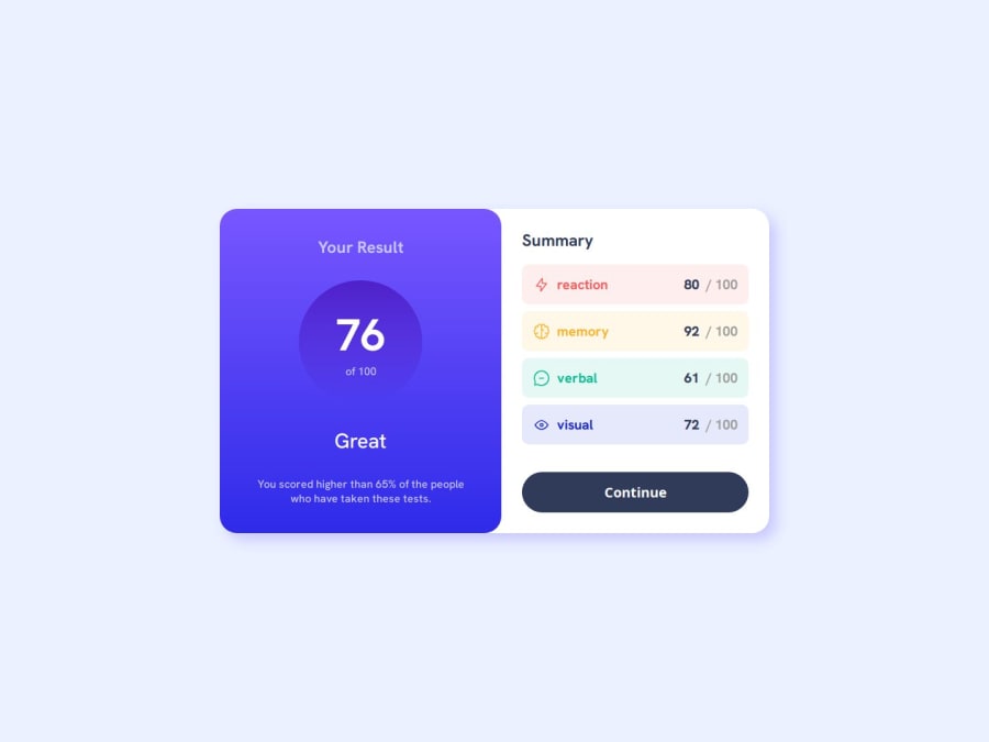
Design comparison
Solution retrospective
Any feedback?
Community feedback
- @danielmrz-devPosted 10 months ago
Hello @iabdwahab!
Your solution looks excelent!
I have just one suggestion:
📌 Consider this tweak for your HTML code:
To improve semantic clarity, maintain the titles hierarchy with
<h1>,<h2><h3>, and so on.It's more than just text size — it's about structuring your content effectively:
<h1>to<h6>are used to define HTML headings, with <h1> being the most significant.- Stick to one
<h1>per page for the main title.
While these adjustments might not alter the visual appearance much, they significantly enhance semantic clarity, SEO optimization, and accessibility.
Hope this suggestion proves helpful! Keep up the great work!
0 - @Alokray007Posted 10 months ago
Hello there 👋
Good job on completing the challenge !
Your project looks really good!
I have a suggestion about your code that might interest you.
There is an very useful browser extension called Perfect Pixel that allow you compare with the design image and thus see the exact dimensions. I recommend it to you.
📌 Tags like <div> and <span> are typical examples of non-semantic HTML elements. They serve only as content holders but give no indication as to what type of content they contain or what role that content plays on the page. This tag change does not impact your project visually and makes your HTML code more semantic, improving SEO optimization as well as the accessibility of your project.
I hope this suggestion is useful for future projects.
Other than that, great job!
Happy coding.
0
Please log in to post a comment
Log in with GitHubJoin our Discord community
Join thousands of Frontend Mentor community members taking the challenges, sharing resources, helping each other, and chatting about all things front-end!
Join our Discord
