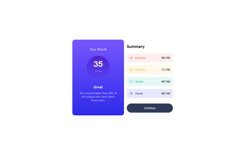
Results summary component (my take) HTML, CSS, JS
Design comparison
Solution retrospective
This is my take for this challenge. I've used HTML, CSS and JavScript. I used random numbers for the values but i didn't managed to link the button. Any suggestions for this or anything else are welcome. Also i used media query for the mobile version using a mobile-first approach.
Community feedback
- @pperdanaPosted over 1 year ago
Hello thereπ!! Congratulations on completing this challange.
- I have some additional recommendations for your code that I think you'll find interesting and valuable.
π Image element do not have
alt
attributesin script.js
<img src="${stat.icon}" id="icon-${index}" class="icon">
In this code you should add
alt
in your code, with value that tell about your image<img src="${stat.icon}" id="icon-${index}" class="icon" alt="${alt}">
- This
alt
attribute provides alternative text for images, which is important for accessibility purposes. Screen readers, use the alt attribute to read out loud what the image is about, allowing visually impaired users to understand the content of the page.
I hope you found this helpful! π
Happy codingπ€
Marked as helpful1@dariuss1123Posted over 1 year ago@Panji200 thanks a lot. i did forgot about the alt text but maybe because i tought of them as icons. I will do at when i edit the project. Have a good day!
0 - @0xabdulkhaliqPosted over 1 year ago
Hello there π. Congratulations on successfully completing the challenge! π
- I have other recommendations regarding your code that I believe will be of great interest to you.
BODY MEASUREMENTS π:
- Use
min-height: 100vh
forbody
instead ofheight: 100vh
. Setting theheight: 100vh
may result in the component being cut off on smaller screens.
- For example; if we set
height: 100vh
then thebody
will have100vh
height no matter what. Even if the content spans more than100vh
.
- But if we set
min-height: 100vh
then thebody
will start at100vh
, if the content pushes thebody
beyond100vh
it will continue growing. However if you have content that takes less than100vh
it will still take100vh
in space.
.
I hope you find this helpful π Above all, the solution you submitted is great !
Happy coding!
Marked as helpful1@dariuss1123Posted over 1 year ago@0xAbdulKhalid hello. thanks a lot for your review. I've already used min-height instead on height on a project and it worked really well. I will edit this also and maybe i can post here the updated solution. Thank you for the kind words and have a nice day!
Happy coding!
0 - @DeeokaforPosted over 1 year ago
Hello Busca Darius, you are doing good. I would want to point out that your
drop shadow
orbox shadow
which should surround the card isn't apparent thereby making the card not so distinct from the background. It would be nice if you could effect that to deliver a top-notch project.Keep Pushing!!
Marked as helpful1@dariuss1123Posted over 1 year ago@Deeokafor thank you! I apparently forgot about the box-shadow :))
Have a great day!
0 - @doganfurkanPosted over 1 year ago
Hello there! You did a good job, congrats! I've some suggestions though:
- Since you gave your body a height of 100vh, it sometimes doesn't show the whole content. If you change it to min-height, at least, you would give it room to scroll through content.
- You have a div with the class of result-div, and you are using percentages to give it a size. Don't declare both the height and width. To have it as a perfect circle, I recommend giving it
width: 50% (for example); aspect-ratio:1
styling. Aspect-ratio makes the height and width equal. - Your result-div doesn't show the elements in the center. If you make it a flexbox, assign the flex-direction as column, and apply
justify-content: center
you can have them centered. Also, get rid of that<br/>
tag to adjust the gap. - Why do you limit your container to 375px for mobile? Your breakpoint is somewhat like 400px already. I think, do not leave that little space on the sides. Give it a
width:100%
for mobile and increase the padding.
I think just those can make a big difference in appearance.
Have fun building!
Marked as helpful1@dariuss1123Posted over 1 year ago@doganfurkan thanks a lot. i've had a lot of trouble with that circle! And i will go and experiment with the other aspects you've mentioned! Have a nice day!
1@doganfurkanPosted over 1 year ago@dariuss1123 You are welcome! Just to clarify though,
aspect-ratio: 1
does make the width and height equal like I said, but I forgot to mention how it works.aspect-ratio:2
makes the width 2 times the size of height, andaspect-ratio:1/2
makes it half the height. It is not just for equaling them, you can play with it whenever you need.Have a good day!
Marked as helpful1@dariuss1123Posted over 1 year ago@doganfurkan really helpful stuff, my friend. I've never used aspect-ratio before so this looks like a game changer! Cheers!
1 - @secretcrew2Posted over 1 year ago
One way to link your button to javascript is to add an attribute of onclick = function{} on your button.
Example:
<button onclick="someFunction()"></button>
Happy coding βΊοΈ
1@dariuss1123Posted over 1 year ago@secretcrew2 thanks. i know that but the issue is after i link it because i did the project with random numbers and i don't know how to change them using the button. But thank you anyway and happy coding!
0
Please log in to post a comment
Log in with GitHubJoin our Discord community
Join thousands of Frontend Mentor community members taking the challenges, sharing resources, helping each other, and chatting about all things front-end!
Join our Discord