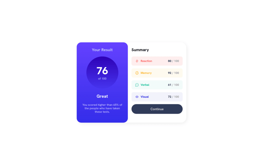
Design comparison
Solution retrospective
Hi there, hope you are well. If you have a little free time just take a look at my solution to this project. As a starting point I chose Mobile first design and Flexbox. Using some media queries magic it went responsive for desktops.
Community feedback
- @heisemmaco-devPosted over 1 year ago
Hi Oleg, i really try for the responsive layout an i see that try to use different html tags like selection and main to wrap your two container both the right and left, congratulation for that but you didn't add border-shadow too your main wrap. i hope you find this helpful
Marked as helpful0@mrJ0oPosted over 1 year ago@Moderateemmaco Hi there) In the first place, thanks for your response. I didn’t even notice the shadow-border was missing. Now it’s fixed and should add up to the main design.
0
Please log in to post a comment
Log in with GitHubJoin our Discord community
Join thousands of Frontend Mentor community members taking the challenges, sharing resources, helping each other, and chatting about all things front-end!
Join our Discord
