Design comparison
Solution retrospective
Please take a look and let me know if there is something different you would.
Community feedback
- @MelvinAguilarPosted 11 months ago
Hello there 👋. Good job on completing the challenge !
I have some suggestions about your code that might interest you.
HTML 🏷️:
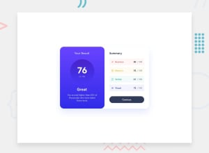
- Even though the number '76' is the largest text in the component, it doesn't necessarily mean it should be an <h1>. Headings have a hierarchy and are meant to indicate the structure and importance of content .In your solution, one of the important header elements is a number that does not describe the component itself.
- The <div> tag can be useful for styling and positioning, but it doesn't convey any semantic meaning. Instead, consider using more semantic elements like <p> to better describe the type of content.
I hope you find it useful! 😄 Above all, the solution you submitted is great!
Happy coding!
Marked as helpful0 - @danielmrz-devPosted 11 months ago
Hello @vcgmuse!
Your solution looks great!
I have a couple of very simple suggestions:
-
First: The right side of your card is missing the border radius on desktop version. You can add the border and also
overflow: hidden;in order to show it. -
Second: The
.attributioncontainer is supposed to be a footer on the page. Place it outside the card so it won't take up space unnecessarily.
I hope it helps!
Other than those details, you did an excellent job!
Marked as helpful0@vcgmusePosted 11 months ago@danielmrz-dev Hey thanks, every bit of help makes a difference. I appreciate you making my coder better.
1 -
Please log in to post a comment
Log in with GitHubJoin our Discord community
Join thousands of Frontend Mentor community members taking the challenges, sharing resources, helping each other, and chatting about all things front-end!
Join our Discord
