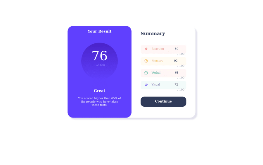
Design comparison
SolutionDesign
Community feedback
- @kaseyveePosted over 1 year ago
A great way to space items without individually setting margins to children items is with flexbox!
For example:
.conte2 {
   display: flex; // children become in-line (in a row)
   flex-direction: column;  // this is by default row, so we set it to column
   gap: 20px;  // adds spacing only BETWEEN the children
   padding: 30px;  // adds equal spacing along the inner sides of the parent div
}
justify-content: space-between;also works great in place of gap if you have a set height for the parent div.Here, I think it would also be helpful to add .sub1-4 in an intermediate div within .conte2 and apply the same properties as above without padding.
Overall great job so far!
0 - @danielex1999Posted over 1 year ago
Use this to reset all margins and paddings
* {
  margin: 0;
  padding: 0;
  box-sizing: border-box;
}
To center this card maybe you can use
display: flex;
 justify-content: center;
 align-items: center;
0
Please log in to post a comment
Log in with GitHubJoin our Discord community
Join thousands of Frontend Mentor community members taking the challenges, sharing resources, helping each other, and chatting about all things front-end!
Join our Discord
