Design comparison
SolutionDesign
Solution retrospective
Hello guys, I would like hear all feedback of the yours about my project. A huge hug and sucefull everyone
Community feedback
- @AndreiTihPosted 11 months ago
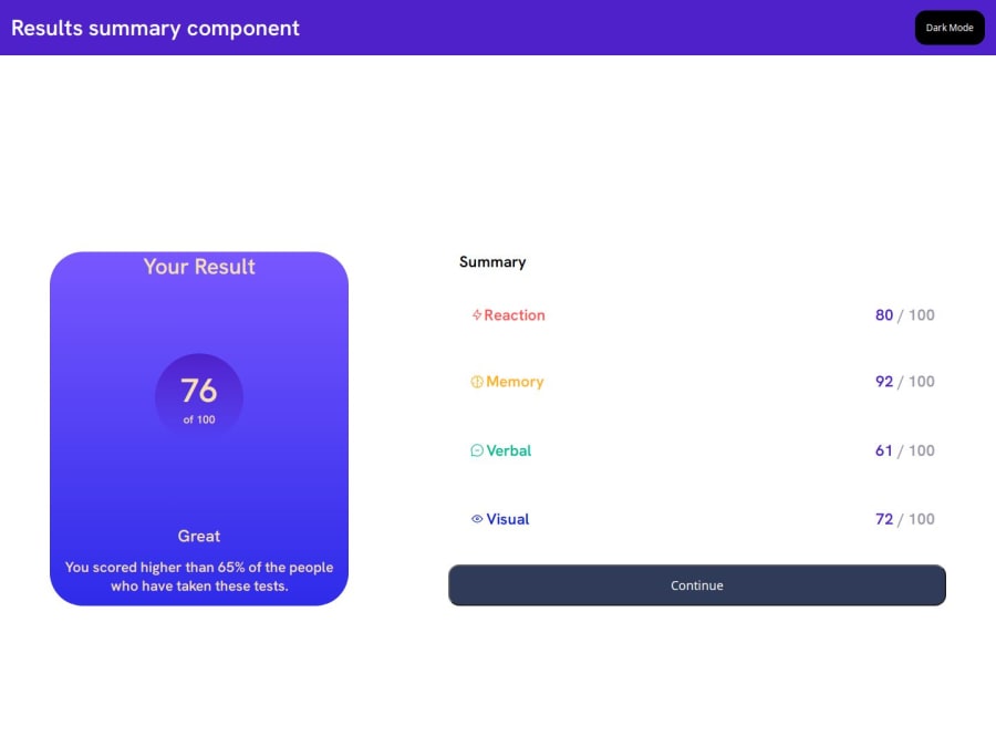
Great job! There's many things you could do to get closer to the design. 2 easy ones are:
- You could include the box-shadow property on the outer container to better match the design.
- Right now there's a gap between the result box and the summary box. You could make them touch by making the outer container just small enough to contain both of them. Try using
width: fit-contentin the .container class instead ofwidth:100%. You would then need to adjust the width of each child to better match the design.
0@DanielKremesPosted 11 months ago@AndreiTih thanks for the feedback. i liked this tipe about width: fit-content. sucess and good stuidies
0
Please log in to post a comment
Log in with GitHubJoin our Discord community
Join thousands of Frontend Mentor community members taking the challenges, sharing resources, helping each other, and chatting about all things front-end!
Join our Discord
