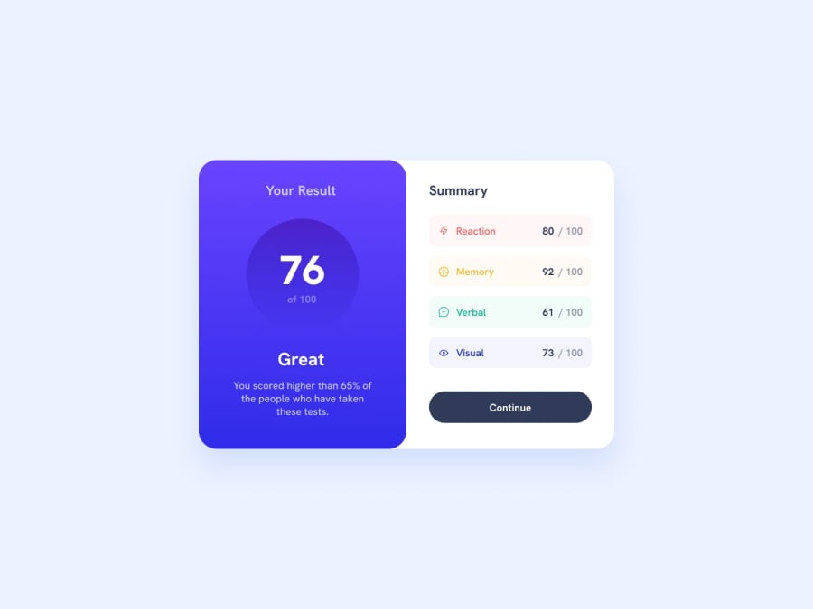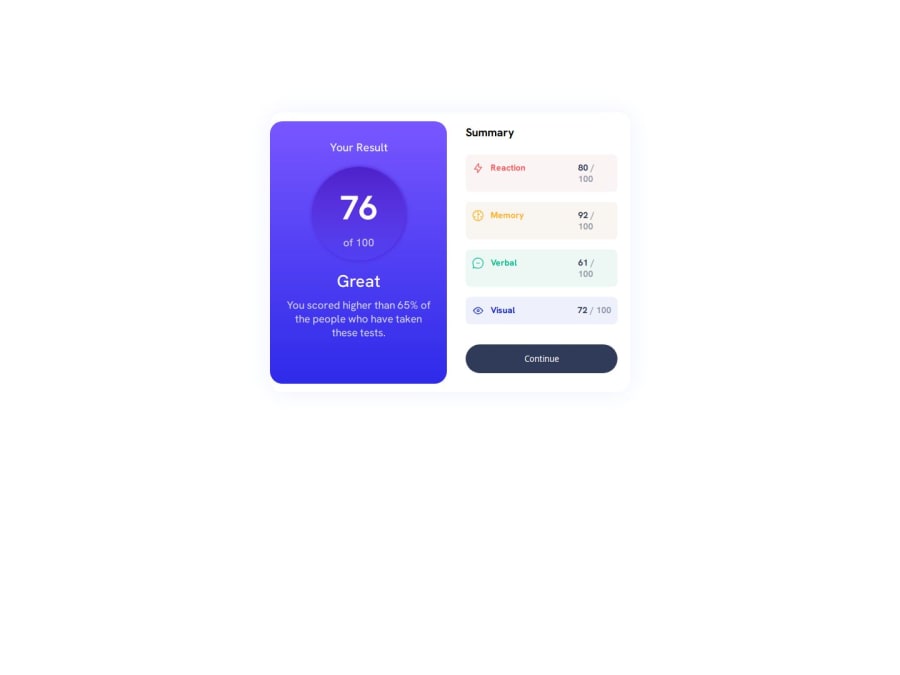
Design comparison
Solution retrospective
I'm most proud to have finished this challenge, It was a challenging but amazing experience!
What challenges did you encounter, and how did you overcome them?working on the circle, individually styling the right div components, and making the page responsive.
What specific areas of your project would you like help with?I believe there is a better solution to this problem. Could you please review the code and share your thoughts? Thank you.
Community feedback
- @R3ygoskiPosted 7 months ago
Hello @Omowunmikamil, I would like to start by congratulating you, as your solution looks very good.
I'd like to give you some tips regarding your CSS. Instead of using
margin
to center, try using the following snippet in yourbody
selector:display: flex; justify-content: center; align-items: center; height: 100vh;
This way, your
body
will center the card. For your.container
, change themargin
to something likemargin: 0 1rem;
, which will provide external spacing as the screen size decreases. Also, try usingclamp()
to set a minimum, base, and maximum size for your.container
.Regarding your HTML, it's very well-structured. I would only suggest two things to make it more semantic:
<section class="left"> and <section class="right">
could be changed to<article>
, as the content of both is self-explanatory and independent of the main context of the page.<div class="reaction">
, not only this one but also the others, I would recommend placing them within a<ul>
and<li>
, as they are similar items that share characteristics. So,<ul>
would be more appropriate.
You also used "Your result" as
<h2>
, but it would be more appropriate as<h1>
. While the numbers could be<span>
, and "Great" would probably be a<p>
, as it's not a subheading or something similar.One last thing I noticed regarding the use of
<svg>
, you don't need to use it that way. You can import it through ansrc
attribute of an<img/>
, which would make the HTML cleaner. We usually use<svg>
only when we want to make direct changes to it.Again, congratulations on your project! It looks very good. Keep practicing and improving. If you have any questions, please feel free to comment below, and I'll do my best to help.
Marked as helpful1 - @bienvenudevPosted 7 months ago
Hello!
Well done, here are some things to improve:
- Try to make this responsive on all screen sizes.
- Work mobile first when it comes to styling. Have dev tools open on the side and shrink the viewport narrow. Start from there. The default styles should always look good on mobile.
- Include a modern CSS reset at the beginning of your styles to help normalize browser defaults and provide a clean foundation for your project. (Check out this article: https://www.joshwcomeau.com/css/custom-css-reset/)
- Use headings appropriately and in the correct order.
- Do you mean to use em where you're using it? Em should be a very intentional choice when you specifically want a property to scale with that element's font size.
- Media queries must always be defined in rem or em not px
- It's better for performance to link fonts in the html head instead of css imports
- Font size must never ever be in px (https://fedmentor.dev/posts/font-size-px/)
Additional resources:
- Kevin Powell's walkthrough: https://www.youtube.com/watch?v=KqFAs5d3Yl8
- A free course on building responsive layouts (https://courses.kevinpowell.co/conquering-responsive-layouts)
I hope these tips and resources are helpful! Feel free to connect and ask any questions you might have.
Happy Coding!
Marked as helpful0@OmowunmikamilPosted 7 months agoThank you @jwben1 This will be very helpful.
0
Please log in to post a comment
Log in with GitHubJoin our Discord community
Join thousands of Frontend Mentor community members taking the challenges, sharing resources, helping each other, and chatting about all things front-end!
Join our Discord