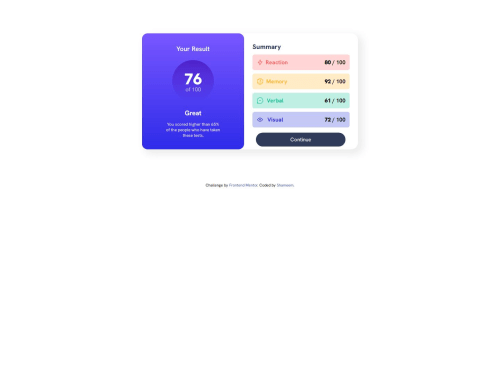
Design comparison
Solution retrospective
What did you find difficult while building the project?
Community feedback
- @danielmrz-devPosted 9 months ago
Hello @shameem-dev!
Your project looks great!
I have one suggestion for you to improve it even more:
- Using
margin
is not the best option to center an element. Here's a very efficient (and better) way to place an element in the middle of the page both vertically and horizontally:
π Apply this to the body (in order to work properly, don't use position or margins):
body { min-height: 100vh; display: flex; /* it works with grid too */ justify-content: center; align-items: center; }
I hope it helps!
Other than that, great job!
Marked as helpful1 - Using
- @Alokray007Posted 9 months ago
Hello there π
Good job on completing the challenge !
Your project looks really good!
I have a suggestion about your code that might interest you.
There is an very useful browser extension called Perfect Pixel that allow you compare with the design image and thus see the exact dimensions. I recommend it to you.
π Tags like <div> and <span> are typical examples of non-semantic HTML elements. They serve only as content holders but give no indication as to what type of content they contain or what role that content plays on the page. This tag change does not impact your project visually and makes your HTML code more semantic, improving SEO optimization as well as the accessibility of your project.
I hope this suggestion is useful for future projects.
Other than that, great job!
Happy coding.
Marked as helpful1
Please log in to post a comment
Log in with GitHubJoin our Discord community
Join thousands of Frontend Mentor community members taking the challenges, sharing resources, helping each other, and chatting about all things front-end!
Join our Discord