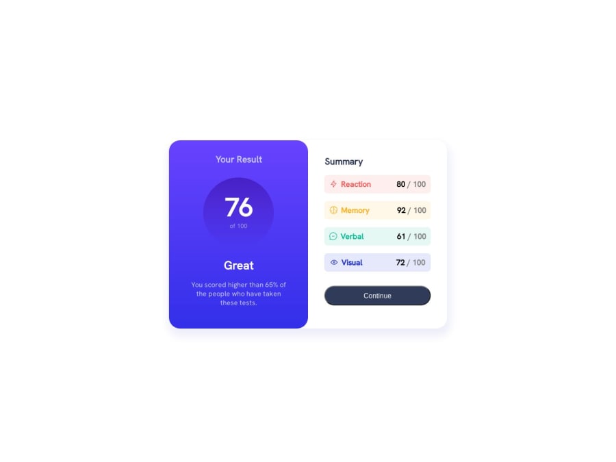
Design comparison
Solution retrospective
- The difficult part of this project was to make the website responsive.
- I think the HTML and CSS are not good enough I should have used div instead of unordered list and I have used too many margins in the CSS and I dont know how to write it efficiently.
- I want to know how to improve the CSS part.
Community feedback
- @climb512Posted over 1 year ago
Looks great!
I have a couple of suggestions you might want to consider:
-- The first suggestion is just a design choice, but I have found it very useful in my own projects: It is the paradigm of "mobile-first" development. This just means to layout and style the mobile version first, then put your changes for larger screen sizes in your media query. So your media query could be something like:
@media (min-width: 700px) { // all css for desktop goes here }
-- Again with media queries: right now you have:
@media (min-width: 400px) and (max-width: 500px) {}
...so this means that below 400px your design will revert back to your desktop settings -- not what you want. So if you are sticking with the desktop-first paradigm, you can just remove the lower bound and have:
@media (max-width: 500px) {}
... but I suggest mobile-first :)
-- One way to minimize the specific margins is to use Grid with grid-template-areas, like this:
.card { display:grid; gap: 4px; grid-template-areas: "A B C C C C C C C C C D"; justify-items: end; align-items: center; }
.icon { grid-area: A; }
.mode { grid-area: B; }
.score { color: black; font-weight: 800;
grid-area: C; }The code above is from my own solution, which you can see here: https://github.com/climb512/results-summary-component-main
Your solution looks great from 400px and up! You should think about adding the data by JSON next!
Ted
Marked as helpful1 - @itushPosted over 1 year ago
Congratulations on completing the challenge! π
- To make it mobile responsive it is important to first understand how the breakpoints works with the media queries, which breakpoints to target etc.
In my projects:
- I always start with mobile-first workflow.
- I use at least one main element for a page (entire content goes into the main, if I'm not using header & footer), and avoid divs as much as possible and use section and article element wherever I can.
<body> <main> All content </main> </body>
-
I Use relative units as much as possible and avoid absolute units whenever possible.
-
If you are someone who is just starting out with front-end development, I strongly suggest starting with the QR code component project(which you did). Also in the challenges page you may filter by (Newbie, HTML&CSS) sort by (easier first) to select projects that will help you solidify your foundation. To avoid any potential knowledge gapβ οΈ please first solidify HTML, CSS, JS fundamentals and then move on to any framework or library.
-
I remember when I started out, I made countless mistakes and spent long hours searching for solutions. But hey, you don't need to go through the same struggles! π To help you shorten the learning curve, I recommend going through the following articles. They contain valuable insights that can make your journey smoother:
ππ 12 important CSS topics where I discuss about css position, z-index, box-model, flexbox, grid, media queries, mobile-first workflow, best practices etc. in a simple way.
ππ 11 important HTML topics where I discuss about my thought process and approach to convert a design/mock-up to HTML along with other topics.
I hope you find these resources helpful in your coding adventures! π€
I'm eagerly looking forward to seeing the amazing projects you'll create in the future! ππ»
Keep up the fantastic work and happy hacking! πͺβ¨
0
Please log in to post a comment
Log in with GitHubJoin our Discord community
Join thousands of Frontend Mentor community members taking the challenges, sharing resources, helping each other, and chatting about all things front-end!
Join our Discord