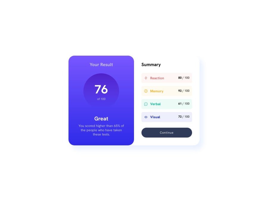
results summary component (grid and flex-box)


Design comparison

Solution retrospective
i think i screwed up the mobile layout
Community feedback
- @the-coding-beekeeperPosted about 1 year ago
Hi AnAvilableUsername!
Congratulations for finishing this project! Your solution is quite close to the given template, very nice shot.
I have some suggestions to improve your code: It seems that you use the <h> tags for styling-purposes, but this is not good practice. The <h> tags should represent the structure of the page. Imagine the structure of your <h> tags like the summary of a book (one title <h1>, chapters <h2>, ...).
To make your code better readable and better structured, try to replace some <div> tags with semantic html like <main>, <section>, ...etc.
Replace the hard-coded, absolute px-values of your divs with relative values like rem or em. That is very important to make your code responsive.
To make your code responsive, you should add a mediaquery. To write down all the necessary changes in your code would go too far. But as a guideline: most of the time the mobile-first-approach is the better way.
I hope my feedback helps you to a little.
Happy coding and greetings! The-coding-beekeeper
0

Please log in to post a comment
Log in with GitHubJoin our Discord community
Join thousands of Frontend Mentor community members taking the challenges, sharing resources, helping each other, and chatting about all things front-end!
Join our Discord