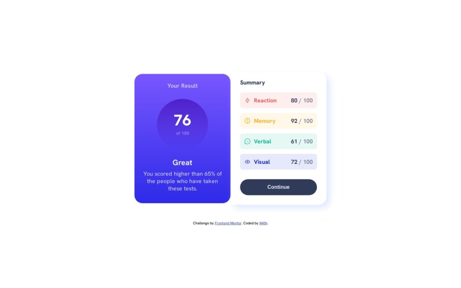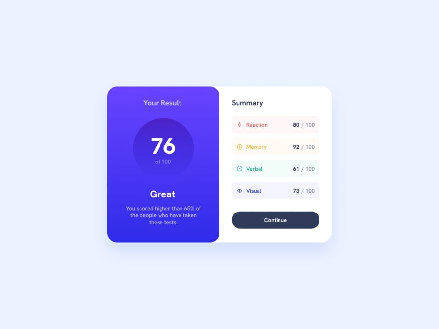
Design comparison
SolutionDesign
Solution retrospective
I'm not sure about 2 things in my code, any feedback about these are welcome.
NOTE: I didn't use any figma files, i've only use the given assets.
- How about breakpoints? I've only set one for mobile, what are the others options available to fit the desired design?
- How about the width of the 2 sections components? I'm pretty sure that my summary section is quite a bit to big regardless the final design, also my button seems strange, any advice for it is appreciated.
Community feedback
Please log in to post a comment
Log in with GitHubJoin our Discord community
Join thousands of Frontend Mentor community members taking the challenges, sharing resources, helping each other, and chatting about all things front-end!
Join our Discord
