Design comparison
Community feedback
- @izzatrazabPosted over 1 year ago
Hi, firstly I am not really qualify to comment people's work as I am a beginner myself. Plus, your portfolio page prove that you already have a lot of experience. But I will try and give suggestion that may benefits you.
-
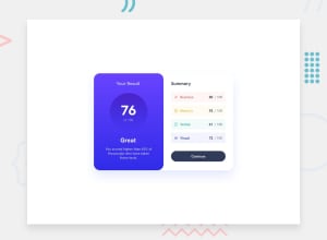
Colour Scheme: I can see that you did not follow the color scheme suggested in the challenge. But it doesn't really matter much. What matters is the contrast (especially the fonts) of the content you want to show to the users. It's hard to read your page. One trick to realize how good or bad your contrast is to read your page while blinking your eyes fast (Basically you restrict your eyes from focusing). You will find it is hard to read your page properly while blinking fast.
-
Gradient: you're not using any gradient suggested in the solution. Gradient is really hard to do manually. Thus, use gradient generator. My favourite would be: https://cssgradient.io/.
-
h element: I can see that you're using h4 for "Your Result" and "Summary". I bet you use h4 because of its size right? Actually this is not good practice for SEO (but it is not a major flaw, so do not worry too much). Watch this: https://www.youtube.com/watch?v=cOmehxAU_4s at 6:37 web elements
-
CSS: I can't really comment on your css because you also use bootstrap, I am not that experience in using bootstrap. But do use flexbox, it will make your life easier.
That is all that I got for you. Hope these helps.
1@jhelms82Posted over 1 year ago@izzatrazab Thanks, i honesty need work on color contrast in general, thats a great tip on blinking my eyes.
0 -
Please log in to post a comment
Log in with GitHubJoin our Discord community
Join thousands of Frontend Mentor community members taking the challenges, sharing resources, helping each other, and chatting about all things front-end!
Join our Discord
