Not Found
Not Found
Not Found
Not Found
Not Found
Not Found
Not Found
Not Found
Not Found
Not Found
Not Found
Not Found
Not Found
Not Found
Not Found
Not Found
Not Found
Not Found
Not Found
Not Found

Submitted

Results summary component

@ribeiroLevi

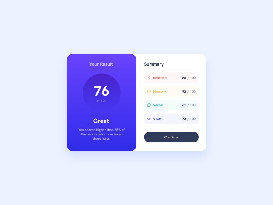
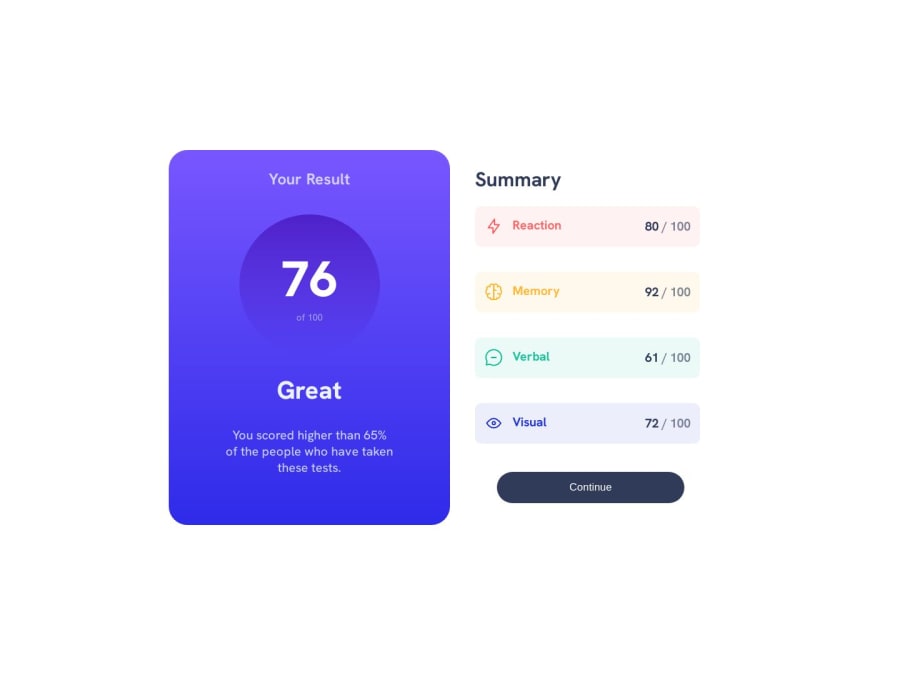
Desktop design screenshot for the Results summary component coding challenge

This is a solution for...

  • HTML
  • CSS
1newbie
View challenge

Design comparison


SolutionDesign

Solution retrospective


Feel free to tell me about any mistakes ou things i didn't do in the best way, any feedback is welcome, thanks in advance :)

Community feedback

@chinh1402

Posted

I agree with Reza Sajjadian comment, I'll provide my suggestion in addition to his comment:

  1. The spacing between Summary items is too large, It would look better if you shorten that spacing a bit. Because those items are similar to each other, should be positioned close to each other to form a group.
  2. Without box-shadow, the Summary part blended into white background, and that's bad practice. As far as I am concerned, box-shadow can't really be extracted just by looking at a jpeg image, if there's a design file, the job is much simpler. In this case (jpeg), you should choose one box-shadow that looks similar to the design file by searching for one on Google, I suggest cssscan

Marked as helpful

0

@ribeiroLevi

Posted

@chinh1402 the box-shadow really is a question for me, because the div i used to contain the project - marked with the id = "container" - occupies 100% width and 100% height and i'm not sure how to make a div to contain ONLY the project, instead of the whole screen. Any tips? thanks for the advice! :)

0

@chinh1402

Posted

@ribeiroLevi My solution is to make another div inside the div with id = "content" like so:

<div id="container">
<div id="content">
<div id="score">...</div>
<div id="summary">...</div>
</div>
</div>

That way, the div with id = "content" will only wrap around the project instead of the whole screen, you can do box-shadow on that div

Marked as helpful

0

@reza-sjdn

Posted

hello dear @ribeiroLevi, well done, everything's almost perfect but

  1. It's not responsive and you haven't designed mobile view
  2. you didn't set any box-shadow on white section
  3. and maybe it's a little bit big to my eyes

anyway, your attempt is worth a lot!

1

@ribeiroLevi

Posted

@reza-sjdn thanks! i'm still studiyng responsive screens, and its indeed a little too big, i'll try to improve this! :)

1

Please log in to post a comment

Log in with GitHub
Discord logo

Join our Discord community

Join thousands of Frontend Mentor community members taking the challenges, sharing resources, helping each other, and chatting about all things front-end!

Join our Discord