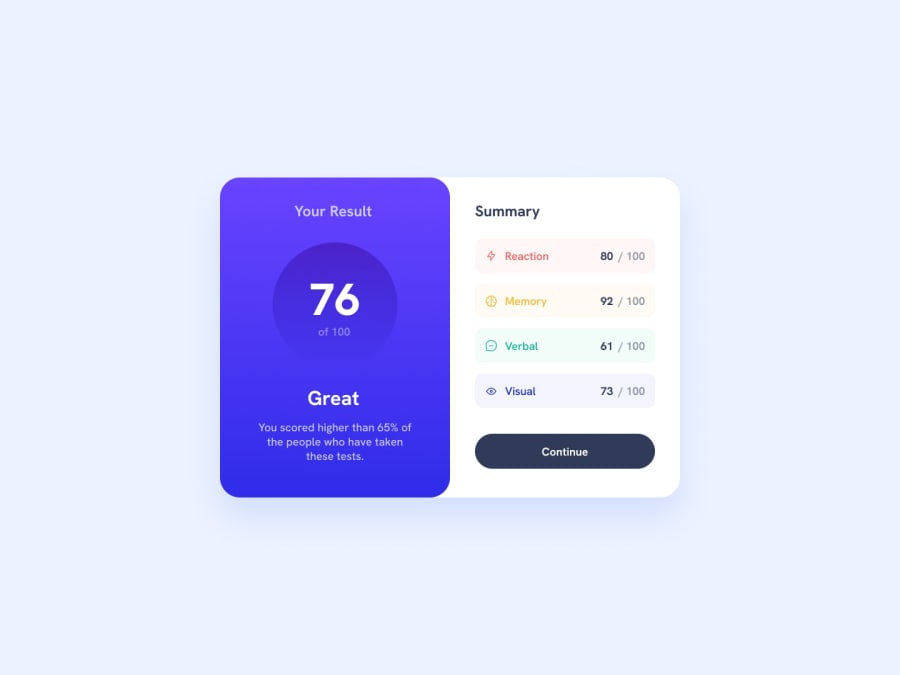
Design comparison
SolutionDesign
Solution retrospective
ฅ^•ﻌ•^ฅ Hello, Frontend Mentor coding community. This is my solution for the Results Summary Component
I had a hard time with making gradient background for the results tab and button. So, if there are any resources that you think can help me with that then I greatly appreciate your help. I also couldn't figure out the colors properly. I don't know what tools to use to figure that out. I uploaded the image files to figma but I can't figure out how to get the colors.
Either way, if you have any feedback and tips I greatly appreciate it!
Thanks in advance and happy coding!!
Community feedback
Please log in to post a comment
Log in with GitHubJoin our Discord community
Join thousands of Frontend Mentor community members taking the challenges, sharing resources, helping each other, and chatting about all things front-end!
Join our Discord
