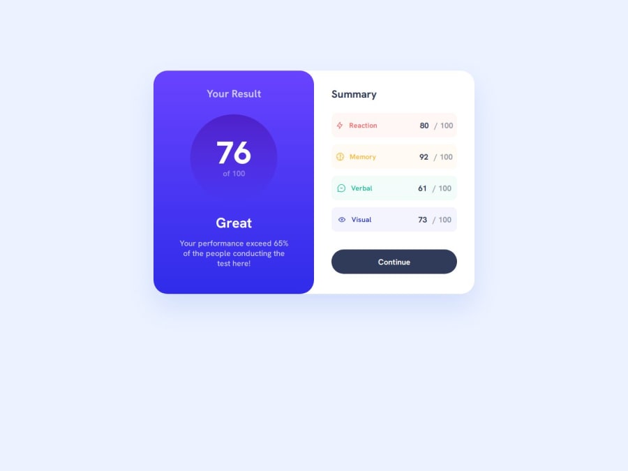


Design comparison
SolutionDesign

Solution retrospective
What are you most proud of, and what would you do differently next time?
i am learning every day new thing can't lie its was so difficult but we manage to finish it
i added couple animation to desktop screen and some animation to the mobile screen so this is something you have to check out
What challenges did you encounter, and how did you overcome them?position was one of my problem cause i have don't different positioning method and got stuck on the media views and couldn't make it work so i went through the position lessons again and had to understand the different between grid and flex
What specific areas of your project would you like help with?grids and flex to know better the using of both and know when i want to use one over the other
Community feedback
Please log in to post a comment
Log in with GitHub
Join our Discord community
Join thousands of Frontend Mentor community members taking the challenges, sharing resources, helping each other, and chatting about all things front-end!
Join our Discord