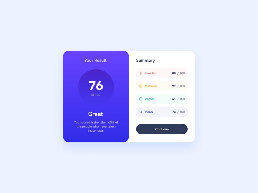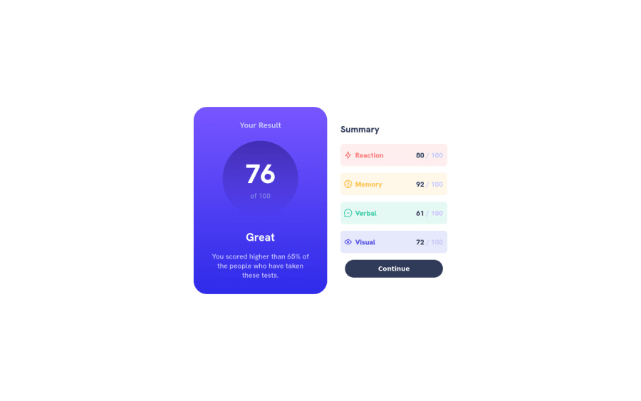
Results Summary Component Challenge Using HTML/CSS
Design comparison
Solution retrospective
I enjoyed this challenge. It was very simple but also forced me to learn about some new concepts like gradients. I also saw that you can't have "transition" working on the gradient hover effect. But I saw how I can still have the some gradient animations using some loopholes.
Community feedback
- @Finney06Posted over 1 year ago
Hello there π. Good job on completing the challenge !
Here are some suggestions regarding your code that may be of interest to you.
HTML π·οΈ:
To clear the Accessibility report:
-
Wrap the page's whole main content in the
<main>
tag. -
Always avoid skipping heading levels; Starting with
<h1>
and working your way down the heading levels (<h2>
,<h3>
, etc.) helps ensure that your document has a clear and consistent hierarchy. -
Use HTML5 semantic elements such as
<header>
,<nav>
,<main>
,<aside>
, and<footer>
to define these sections. -
Use ARIA landmarks such as
<header role="banner">
and<footer role="contentinfo">
to provide additional information about the purpose of each section to assistive technologies.
Here is a web accessibility evaluation toolπ to check your webpage for any remaining errors or warnings related to landmarks.
I hope you find it helpful!π Above all, the solution you submitted is π. πHappy coding!
Marked as helpful0 -
- @0xabdulkhaliqPosted over 1 year ago
Hello there π. Congratulations on successfully completing the challenge! π
- I have other recommendations regarding your code that I believe will be of great interest to you.
HTML π·οΈ:
- Your solution generates accessibility error reports due to
non-semantic
markup
- So fix it by replacing the
<div class="card">
with semantic element<main>
to improve accessibility and organization of your page.
- Use HTML5 semantic elements such as
<header>
,<nav>
,<main>
,<aside>
, and<footer>
to define these sections
I hope you find it useful! π Above all, the solution you submitted is great!
Happy coding!
Marked as helpful0 - @codeme4556Posted over 1 year ago
how did you get this i spent hour trying to figure out the left side
0@KiburstgrPosted over 1 year ago@codeme4556 It helps to think of everything as a box. I created a <div> container for the whole left side. I then set the display to flex to have more control over the items the set flex-direction to column to list them downwards. Then I set align-items:center but not justify-content. I used paddings, and gap to get the spacing right. The color comes by using "background-image: linear-gradient()" attribute. The the circle in the middle is also a <div> with a border-radius set to 50% to created the circle.
I hope this helped :)
0
Please log in to post a comment
Log in with GitHubJoin our Discord community
Join thousands of Frontend Mentor community members taking the challenges, sharing resources, helping each other, and chatting about all things front-end!
Join our Discord