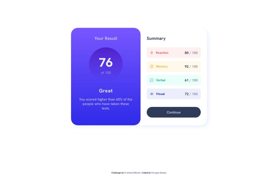
Results Summary Component | Mobile First | Flexbox
Design comparison
Solution retrospective
I have two questions:
- Is it a good practice to use different CSS files for different screen widths? If not then how to design mobile CSS after designing Desktop CSS? (Some things are overridden.)
- How to get the Icons in center? (They are popping up a bit.)
Community feedback
- @fggdbdsbfdPosted over 1 year ago
When designing a website, it's important to start with a desktop-first approach and create a stylesheet that works well on larger screens. Once you have established your base design, you can then create a separate mobile CSS file and make adjustments as necessary.
To ensure that your mobile CSS is effective, you should use media queries to target specific screen sizes and device types. This will help you create a layout that looks and functions well across a variety of devices, without the need for multiple CSS files.
It's worth noting that while using multiple CSS files can be helpful in certain situations, it can also make maintenance more complex. For this reason, it's important to weigh the benefits and drawbacks before deciding whether to use multiple CSS files or not.
Ultimately, the key to successful responsive design is to be flexible and adaptable. By using modern CSS techniques like flexbox and grid layouts, as well as media queries, you can create a design that responds well to a range of screen sizes and device types, without sacrificing functionality or usability.
Marked as helpful1 - @fggdbdsbfdPosted over 1 year ago
To center icons within a container, there are a variety of CSS properties that can be used to adjust the display, alignment, and positioning of elements.
👉 Here's an example of how you can center icons horizontally and vertically within a container using CSS:
HTML code:
<div class="icon-container">
  <i class="fas fa-star"></i>
</div>
CSS code:
 .icon-container {
  display: flex;
  justify-content: center;
  align-items: center;
  height: 100px;
  width: 100px;
  border: 1px solid #000;
}

.fas {
  font-size: 2em;
}
In this example, we utilize the display: flex property to establish a flexible container that enables the easy centering of the icon horizontally and vertically. We also employ the justify-content: center and align-items: center properties to center the icon within the container.
Finally, we set the height and width properties of the container to establish a fixed size, and we use the .fas class to adjust the font size of the icon.
👍 By adjusting the values of these CSS properties, you can tailor the alignment and positioning of icons to suit your unique needs and preferences. This basic approach should help you center icons within a container and create a visually appealing and balanced design.
Marked as helpful0@faruquedewanPosted over 1 year ago@fggdbdsbfd Thank you. Your comments are really helpful. 😊
0 - @0xabdulkhaliqPosted over 1 year ago
Hello there 👋. Congratulations on successfully completing the challenge! 🎉
- I have other recommendations regarding your code that I believe will be of great interest to you.
HTML 🏷️:
- This solution generates accessibility error reports, "All page content should be contained by landmarks" is due to
non-semanticmarkup, which lack landmark for a webpage
- So fix it by replacing the
<div class="div-all">element with the semantic element<main>along with<div class="attribution">into a<footer>element in yourindex.htmlfile to improve accessibility and organization of your page.
- What is meant by landmark ?, They used to define major sections of your page instead of relying on generic elements like
<div>or<span>
- They convey the structure of your page. For example, the
<main>element should include all content directly related to the page's main idea, so there should only be one per page
.
I hope you find this helpful 😄 Above all, the solution you submitted is great !
Happy coding!
Marked as helpful0@faruquedewanPosted over 1 year ago@0xAbdulKhalid Thank you for your valuable feedback. I will keep these things in mind from my next project onwards.
0 - @itsale-oPosted over 1 year ago
About the first question: I use one CSS file for both. I did
- @media(max-width: 1400px) {here I did the desktop deseign} and then
- @media(max-width: 700px){here I did the mobile design}
This usually works.
About the icons: if I get the question right, if you use align-items: center, it may solve the problem
0@faruquedewanPosted over 1 year ago@itsale-o Not working. I meant the four colorful icons on the left side of the design. Notice how they are not in the center. They are a bit above the center.
0@faruquedewanPosted over 1 year ago@itsale-o Also, If you use one CSS file for both designs, on the mobile design, do you specify only the parts/elements that change or copy paste all the elements from the Desktop design and then edit the ones that change?
0@itsale-oPosted over 1 year ago@faruquedewan basically yes. The things that don't change at all, like colors, font, etc I put it out of the @media thing. Only the things that change, like size of the screen, display etc, I made one for desktop and one for mobile
Marked as helpful0@itsale-oPosted over 1 year ago@faruquedewan I see. What worked for me there was to make a single <div> where I put the icon, the text and the score, then for that <div> I used the display: flex, flex-direction: row (because we have the icons, the text and the score, so it will align them horizontally), then justify-content: space-between an then align-items: center (that will center all the elements on the <div> vertically
Marked as helpful0
Please log in to post a comment
Log in with GitHubJoin our Discord community
Join thousands of Frontend Mentor community members taking the challenges, sharing resources, helping each other, and chatting about all things front-end!
Join our Discord
