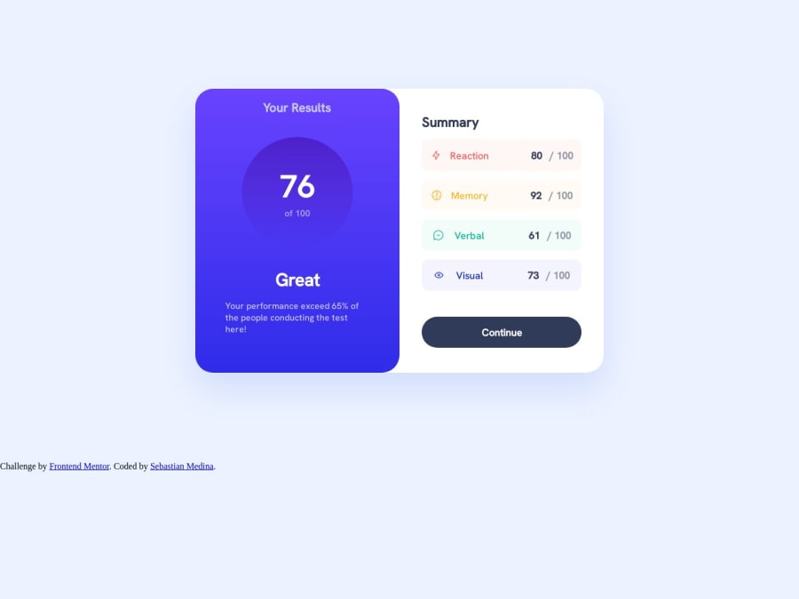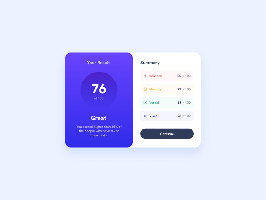
Results summary component challenge build with CSS3 and HTML5
Design comparison
Solution retrospective
I am really happy with all the process I went through. I was able to practice basic, intermidate concepts of building an UX/UI component. There were some keypoints of the challenge that were really interesting. #1, it was like bilding two components in one, or let say it was one component devided in two. Making the correct layout either on desktop or on mobile was really funny due to that. On the other hand, the internal lay out was also a challenge. Normally, I would distribute everything using flexbox. However, this time I had to pllay with some attributions on CSS3 in order to make the internal elements of the component look as similar as possible to the mockup.
Community feedback
Please log in to post a comment
Log in with GitHubJoin our Discord community
Join thousands of Frontend Mentor community members taking the challenges, sharing resources, helping each other, and chatting about all things front-end!
Join our Discord
