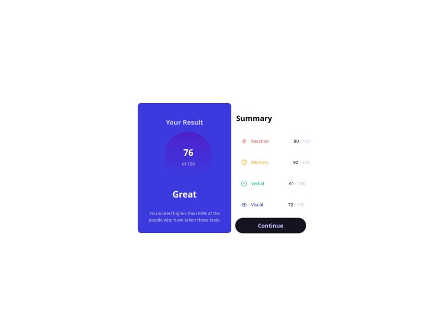
Design comparison
Community feedback
- @tatasadiPosted 12 months ago
Hey there,
Good job on completing this challenge! It's great to see your effort in building this project. Here are some suggestions to further improve your work:
Box Shadow on Card: Adding a box-shadow to your card can significantly enhance the visual appeal. It creates a distinction between the card and the background, making the content stand out.
Use of
<main>Element: Consider wrapping your primary content in a<main>element. This semantic HTML tag is used to enclose the dominant content of the<body>of a document. Using<main>improves accessibility and helps with the document's structure, making it easier for screen readers and search engines to understand the page layout.Heading Elements (h elements): Your use of heading elements can be optimized. For example, you have multiple
<h1>tags, but it's best practice to have only one<h1>per page as it typically represents the main topic. You can use<h2>or<h3>for subheadings to create a better hierarchical structure for your content.Alt Attributes for Images: It's important to provide meaningful alternative text in the
altattribute of images. This improves accessibility for users who rely on screen readers and also benefits SEO. Describe the image briefly in thealttext.Purpose of the Form: Evaluate the need for the commented-out form in your HTML. If it's not serving a specific purpose or related to the challenge, it might be better to remove it to keep the code clean and focused.
By implementing these suggestions, your project will not only look better but also be more accessible and semantically structured. Keep up the good work, and happy coding!
0
Please log in to post a comment
Log in with GitHubJoin our Discord community
Join thousands of Frontend Mentor community members taking the challenges, sharing resources, helping each other, and chatting about all things front-end!
Join our Discord
