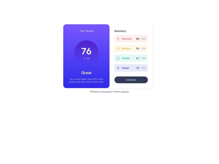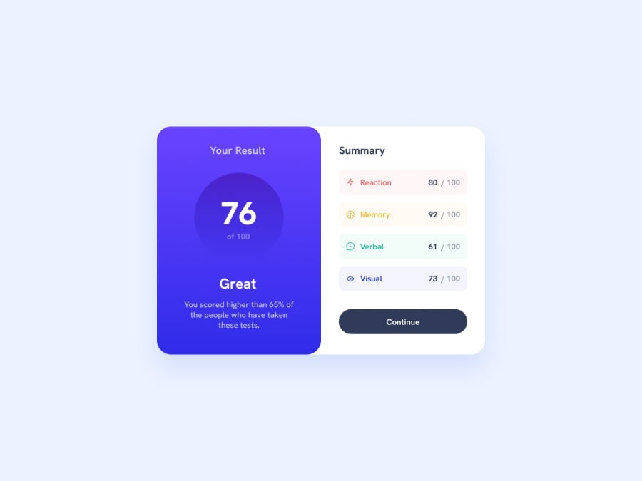
Design comparison
SolutionDesign
Solution retrospective
What are you most proud of, and what would you do differently next time?
I learned to use transform: translateX on this one. I also learned to set my max-width to 'none' in the @media query to get the element to cover the complete width of the screen.
What specific areas of your project would you like help with?I kept adding flexboxes on the right part of the design to get the right spacing between the elements. Is that the best way or is there a better way?
Community feedback
Please log in to post a comment
Log in with GitHubJoin our Discord community
Join thousands of Frontend Mentor community members taking the challenges, sharing resources, helping each other, and chatting about all things front-end!
Join our Discord
