Design comparison
Solution retrospective
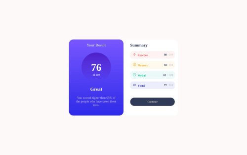
It took my attention that there is thin border style at corners of colorful content. I don't know how it is done so I left it. Any comment is welcome guys.
Community feedback
- @0xabdulkhaliqPosted over 1 year ago
Hello there π. Congratulations on successfully completing the challenge! π
- I have other recommendations regarding your code that I believe will be of great interest to you.
HTML π·οΈ:
- This solution may cause accessibility errors due to lack of semantic markup, which causes lacking of landmark for a webpage and allows accessibility issues to screen readers, due to accessibility errors our website may not reach its intended audience, face legal consequences, and have poor search engine rankings, highlighting the importance of ensuring accessibility and avoiding errors.
- What is meant by landmark ?, They used to define major sections of your page instead of relying on generic elements like
<div>
or<span>
. They are use to provide a more precise detail of the structure of our webpage to the browser or screen readers
- For example:
- The
<main>
element should include all content directly related to the page's main idea, so there should only be one per page - The
<footer>
typically contains information about the author of the section, copyright data or links to related documents.
- The
- So resolve the issue by replacing the
<div class="main-card">
element with the proper semantic element<main>
in yourindex.html
file to improve accessibility and organization of your page
.
I hope you find this helpful π Above all, the solution you submitted is great !
Happy coding!
Marked as helpful1@Sam-52Posted over 1 year agoThank you for your comment. I will be more careful about semantic elements @0xAbdulKhalid
0 - @ryan17stehlePosted over 1 year ago
You can actually specifically target certain corners for border-radius. For example: border-bottom-left-radius: 16px.
1@Sam-52Posted over 1 year agoI knew that. What I did not understand is borders are slightly different in the original design if you look at the coloful content(reaction, memory..) you will see it.@ryan17stehle
0
Please log in to post a comment
Log in with GitHubJoin our Discord community
Join thousands of Frontend Mentor community members taking the challenges, sharing resources, helping each other, and chatting about all things front-end!
Join our Discord