Submitted almost 3 years agoA solution to the Results summary component challenge
Results Summary Component
@myrojoylee

Solution retrospective
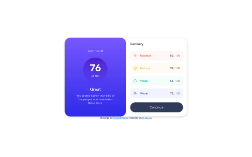
I had problems recreating those partial borders around the Memory/Verbal/Visual/Reaction. I'd never done before, only full borders, so I skipped that part in my CSS. All the solutions I found on Stack Overflow or elsewhere were pretty intermediate/advanced for me and I just couldn't understand them lol. But here is my attempt at the rest of it minus the partial borders...found a codepen to center the entire thing upon window resize and credit is given within. Feedback welcome :).
Code
Loading...
Please log in to post a comment
Log in with GitHubCommunity feedback
No feedback yet. Be the first to give feedback on Myro Joy Lee's solution.
Join our Discord community
Join thousands of Frontend Mentor community members taking the challenges, sharing resources, helping each other, and chatting about all things front-end!
Join our Discord