Design comparison
Solution retrospective
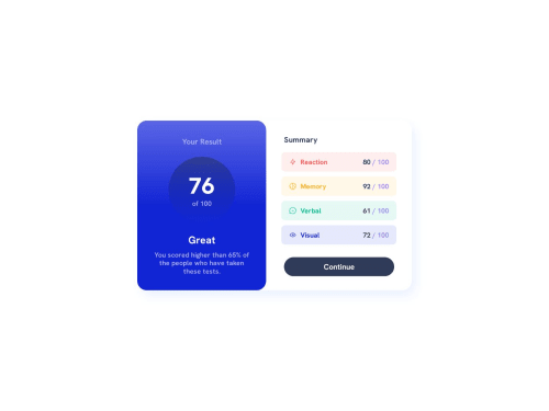
This is my work before adding JS. I think I set it up correctly to where I should be able to link JS event listeners to the specific elements I wanted. I also designed mobile-first this time to ensure a fluid transition to mobile devices. Any feedback is greatly appreciated! :)
Community feedback
- @Bibiwei-PerePosted over 1 year ago
Hi @Whitney
Nice work! But i noticed that your project is not responsive. Use the appropriate media query to make it more responsive.
0@Wdallas12Posted over 1 year ago@Bibiwei-Pere I added the one media query for the dimensions outlined in the instructions, so there is a mobile and desktop version. Is there another one that I should add?
0@Bibiwei-PerePosted over 1 year ago@Wdallas12
The instructions were Desktop 1440px and Mobile 375px. But you used (min-width:1400px). That's to much for a mobile design.
Thanks
0@Wdallas12Posted over 1 year agoAh that's because I decided to go with a mobile-first design process this time. So I did the main body CSS with mobile design in mind and then made the media query the desktop adjustments.
Although to be honest I'm not sure if that's what is meant by mobile-first design. I think I need to do some research on it.
@Bibiwei-Pere
0@Bibiwei-PerePosted over 1 year ago@Wdallas12 Okay, I now understand what you were trying to do.
0 - @mukwende2000Posted over 1 year ago
what do you want javascript for, there is no need for it in this challenge
0@Q8LPs6VsPosted over 1 year ago@mukwende2000
She wants to render the test results from the provided JSON file, which is an optional task given in the challenge description.
1
Please log in to post a comment
Log in with GitHubJoin our Discord community
Join thousands of Frontend Mentor community members taking the challenges, sharing resources, helping each other, and chatting about all things front-end!
Join our Discord