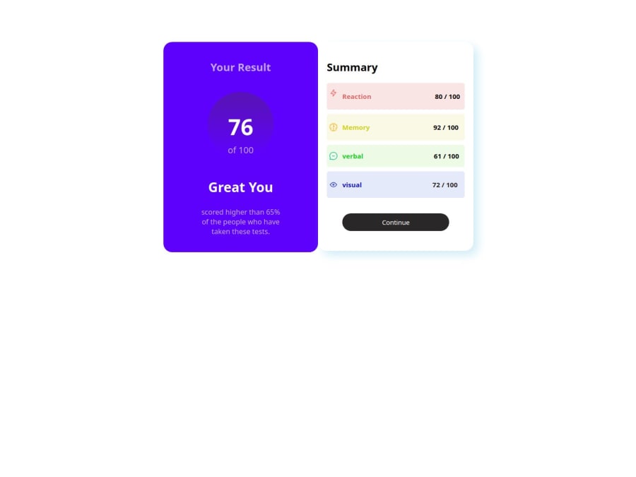
Design comparison
Solution retrospective
As a beginner, although I struggled with the design, I enjoyed the design and learned that organizing the code is important, but this design is messy and because of it, I noticed too late that the percentage in the boxes should have been half black and the other half gray, but it was very enjoyable. Thank you frontend-mentor for these challenges.
Community feedback
- @danielmrz-devPosted 10 months ago
Hello @Xandros9!
Your project looks great!
I have one suggestion for you to improve it even more:
- Using
marginis not the best option to center an element. Here's a very efficient (and better) way to place an element in the middle of the page both vertically and horizontally:
📌 Apply this to the body (in order to work properly, don't use position or margins):
body {
    min-height: 100vh;
    display: flex;  /* it works with grid too  */
    justify-content: center;
    align-items: center;
}
I hope it helps!
Other than that, great job!
Marked as helpful2 - Using
- @Ezekiel225Posted 10 months ago
Hello there 👋 @Xandros9.
Good job on completing the challenge !
Your project looks really good!
I have a suggestion about your code that might interest you.
There is an very useful browser extension called Perfect Pixel that allow you compare with the design image and thus see the exact dimensions. I recommend it to you.
Consider adding a min-height of 100vh to the body element so as to centralize your project.
body {
  min-height: 100vh;
  align-items: center;
  display: flex;
  justify-content: center;
}
I hope this suggestion is useful for future projects.
Other than that, great job!
Happy coding.
0
Please log in to post a comment
Log in with GitHubJoin our Discord community
Join thousands of Frontend Mentor community members taking the challenges, sharing resources, helping each other, and chatting about all things front-end!
Join our Discord
