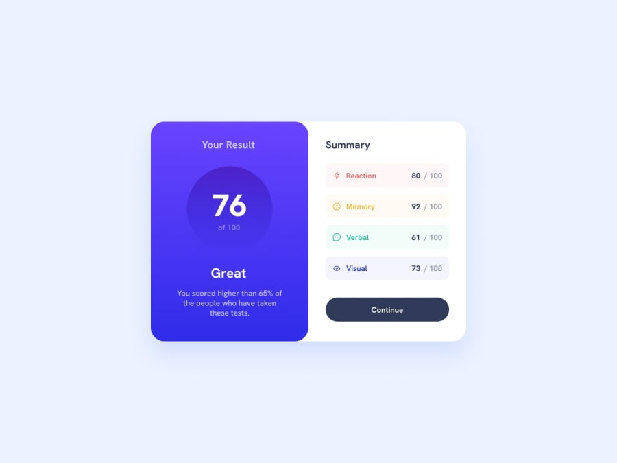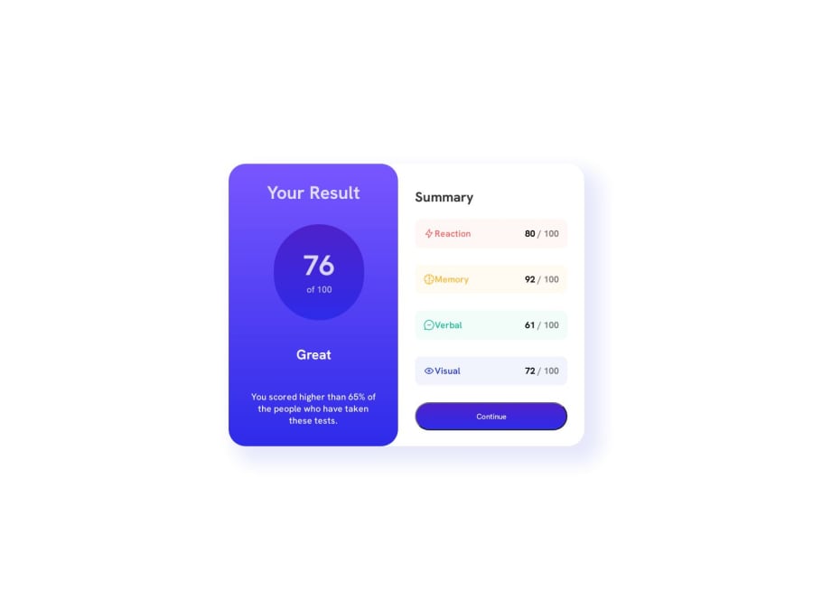
Design comparison
Solution retrospective
I made this code in HTML and CSS, it's my first project, I know I have a lot to improve but I liked the result, I'm open for tips to evolve
Community feedback
- @IamAbhiDevPosted over 1 year ago
Hello, How are you? For a beginner, you did well, and glad to see that you are looking forward to improving yourself! Here are some tips I would like to give you to improve your code:
1. Analyze the Design: Always analyze the design first and plan your HTML markup for the project according to it. Here's a bite-sized tutorial that might help you with that as it did me. And always write your HTML first with proper usage of semantic tags. For more depth, I would highly recommend you read this article where you'll learn how to plan Html for your project by doing the frontendmentor.io's Product Preview Card Component Challenge which is great indeed for beginners to practice their Html and CSS skills.
2. Start Writing CSS: Once you are done with writing your Html for the project, you can go ahead and start writing CSS for your project. Start by writing a CSS Reset to ensure consistent default styles across different browsers and get a clear starting point. Here's an example of a very basic CSS Reset -
*, *::before, *::after { margin: 0; padding: 0; box-sizing: border-box; }
Now it's time to utilize the style-guide.md file to extract the colors used in the design and create a color palette. Define these colors and fonts as variables or constants in your CSS to maintain consistency throughout the project.
Here's an example -
:root { /*Reaction*/ --light-red: hsl(0, 100%, 67%); /*Memory*/ --orangey-yellow: hsl(39, 100%, 56%); /*Verbal*/ --green-teal: hsl(166, 100%, 37%); /*Visual*/ --cobalt-blue: hsl(234, 85%, 45%); /*Reaction bg*/ --light-red-bg: hsla(0, 100%, 67%, 0.05); /*Memory bg*/ --orangey-yellow-bg: hsla(39, 100%, 56%, 0.05); /*Verbal bg*/ --green-teal-bg: hsla(166, 100%, 37%, 0.05); /*Visual bg*/ --cobalt-blue-bg: hsla(234, 85%, 45%, 0.05); --light-slate-blue-bg: hsl(252, 100%, 67%); --light-royal-blue-bg: hsl(241, 81%, 54%); --violet-blue-circle: hsla(256, 72%, 46%, 1); --persian-blue-circle: hsla(241, 72%, 46%, 0); --dark-gray-blue: hsl(224, 30%, 27%); --light-lavender: hsl(241, 100%, 89%); /*Font Weight*/ --light-fw: 500; --mid-fw: 700; --bold-fw: 800; }
After you are done with that, organize your CSS code by dividing it into logical sections or components.
3. Start with Typography: Define the font styles, sizes, line heights, and weights based on the design. Use CSS properties like
font-family
,font-size
,line-height
,font-weight
, andtext-decoration
to style the text.4. Set Up the Layout: Determine the layout structure based on the design. Decide whether to use CSS Grid, Flexbox, or a combination of both for your layout. Create the necessary containers, columns, or grids to establish the desired layout.
5. Style Components and Elements: Begin styling individual components and elements based on their appearance in the design. Select appropriate CSS selectors (classes, IDs, or element selectors) to target the desired elements. Apply appropriate CSS properties like
background
,color
,padding
,margin
,border
, etc., to achieve the desired visual styles.6. Handle Responsiveness: Use media queries to make your design responsive and adapt to different screen sizes. Define breakpoints and adjust styles accordingly to ensure a consistent and user-friendly experience across devices. Always go for the mobile-first approach while designing and developing a responsive website.
In the End, I'll just give you one piece of advice: Allow yourself to be as bad as you can at the beginning. Be consistent and keep learning from others' code too. First, try to write some code on your own without any tutorial or help, and then after finishing it up. Go and take a look at the code of a senior developer and see what can you do to improve your code and trust me, if you keep going like this then you'll eventually be a master. Best of Luck!
Marked as helpful1@LucasCPenaPosted over 1 year ago@IamAbhiDev Thanks for the advice, I'll put it into practice for sure, I'm always open to tips on how to evolve.
2 - @LucasCPenaPosted over 1 year ago
I made this code in HTML and CSS, it's my first project, I know I have a lot to improve but I liked the result, I'm open for tips to evolve
2
Please log in to post a comment
Log in with GitHubJoin our Discord community
Join thousands of Frontend Mentor community members taking the challenges, sharing resources, helping each other, and chatting about all things front-end!
Join our Discord