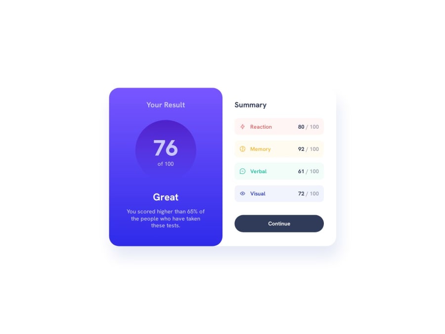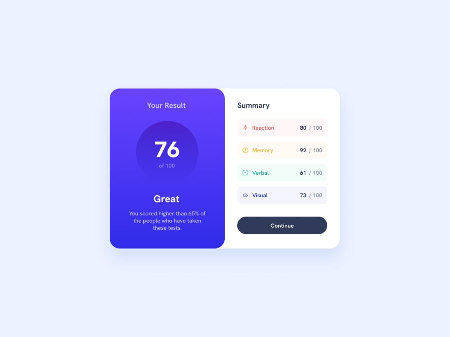
Design comparison
Solution retrospective
Hi! I tried to make the design as accurate as possible but sadly I don't have the Figma files... but! I think it is pretty close to what I can see from the design provided in the project folder. For some reason the colors specified in the styleguide.md look slightly different from the design images. I'd appreciate if anyone could tell me why this happens because in other projects the colors indicated in the style guide looked exactly the same after I used/coded them.
And as always, any advice you may have that could improve my code to make it cleaner, more efficient, or easier to read is welcome!
Community feedback
Please log in to post a comment
Log in with GitHubJoin our Discord community
Join thousands of Frontend Mentor community members taking the challenges, sharing resources, helping each other, and chatting about all things front-end!
Join our Discord
