Not Found
Not Found
Not Found
Not Found
Not Found
Not Found
Not Found
Not Found
Not Found
Not Found
Not Found
Not Found
Not Found
Not Found
Not Found
Not Found
Not Found
Not Found
Not Found
Not Found

Submitted

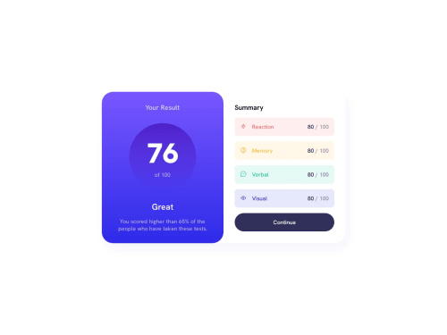
Results Summary Component

Kate Dames 250

@funficient

Desktop design screenshot for the Results summary component coding challenge

This is a solution for...

  • HTML
  • CSS
1newbie
View challenge

Design comparison


SolutionDesign

Solution retrospective


Three questions for the community please!

  1. Why can't I get my linear-gradient background for the circle to work?

I tried the variable defined in the root section: --color-circle-gradient as well as typing the linear-gradient out: linear-gradient(hsl(256, 72%, 46, 1), hsl(241, 72%, 46%, 0)); But nothing works. But if I add a static color (not a gradient) it works perfectly fine!

  1. What is the best way to handle the transparency? It feels as if I'm doing the same thing in multiple places and there should be a better way?

  2. Where can I find resources to help me add the json variables? I can't find any solutions in vanilla HTML and CSS, only Tailwind and other frameworks I'm not familiar with. I would love to give this a go!

And any other feedback on how to improve would be appreciated. Thank you!

Community feedback

P

@Henolivares

Posted

Hi, I reviewed your code, and I found the issue. It's actually so simple, just a typo.

In the custom property --color--circle-gradient-violet: hsla(256, 72%, 46, 1); you missed a % at the third value, that caused anywhere you use that property won't work. It should be --color--circle-gradient-violet: hsla(256, 72%, 46%, 1); and that's it.

A suggestion I can give you is that you can assign custom properties to another, you have --color--circle-gradient-violet: hsl(256, 72%, 46%, 1); --color--circle-gradient-persian-blue: hsl(241, 72%, 46%, 0); --color-circle-gradient: linear-gradient(hsl(256, 72%, 46, 1), hsl(241, 72%, 46%, 0));

which is repeating the values, it should be like this --color--circle-gradient-violet: hsla(256, 72%, 46%, 1); --color--circle-gradient-persian-blue: hsla(241, 72%, 46%, 0);--color-circle-gradient: linear-gradient(var(--color--circle-gradient-violet), var(--color--circle-gradient-persian-blue));

btw, sorry for my English if i make a mistake.

Marked as helpful

1

Kate Dames 250

@funficient

Posted

Thank you SO much @Henolivares ! Well spotted! It works! And thank you for the suggestion to make my variables more understandable, I was wondering how best to handle this!

PS. You're English is great, and your CSS even better! :-)

1

@lukasriha

Posted

Hi Kate!

Great attempt!

I think the reason the gradient doesn't work is because you are using hsl and are providing it 4 arguments - I think you meant to use hsla() - the a stands for alpha channel I believe, and it influences the opacity, I haven tested your code though, so maybe I'm wrong :)

Keep up the work! :)

Marked as helpful

0

@fcojsanchez55

Posted

to me was better using a web like https://cssgradient.io/! i know we need to learn how it works the gradient but sometimes its dificult!

Marked as helpful

0

Kate Dames 250

@funficient

Posted

Great little hack @fcojsanchez55! Thanks for sharing.

0

Please log in to post a comment

Log in with GitHub
Discord logo

Join our Discord community

Join thousands of Frontend Mentor community members taking the challenges, sharing resources, helping each other, and chatting about all things front-end!

Join our Discord