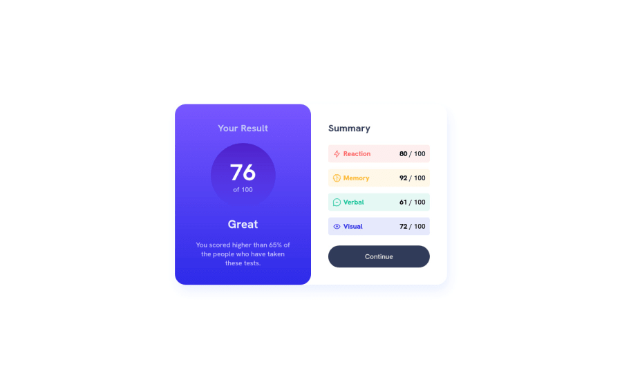
Design comparison
SolutionDesign
Community feedback
- @FrostemanNeogardPosted over 1 year ago
One thing you could improve on mobile is to take up the entire viewport by having your div with the class name "component" to take up the entire width and height of the <main> element. This could be done in a variety of ways, but I think a simple
width: 100vw; height: 100vh;would work in this scenario since there's no other components or padding or margin to worry about.Another thing to improve maintainability in case you'd need to change a color here or maybe a font size there is to store a lot of values inside CSS variables. An example of that could look like this:
// Declare variables with "--{variable-name}"
// Note that you can access variables while declaring other variables,
// for example, you can put primary-light-red and primary-orangey-yellow
// into the example gradient's colors.
--primary-light-red: hsl(0, 100%, 67%);
--primary-orangey-yellow: hsl(39, 100%, 56%);
--example-gradient: linear-gradient(to bottom, red, green);
//

// Access variables with "var(--{variable-name})"
.component_summary_category.reac p:first-of-type() {
    color: var(--primary-light-red);
}

.component_result {
    background: var(--example-gradient);
}
Hope this helps!
0
Please log in to post a comment
Log in with GitHubJoin our Discord community
Join thousands of Frontend Mentor community members taking the challenges, sharing resources, helping each other, and chatting about all things front-end!
Join our Discord
