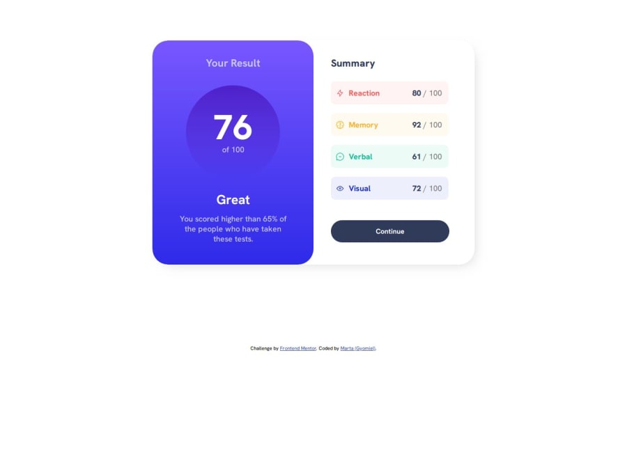
Design comparison
Solution retrospective
This CSS stylesheet can look really messy and overwhelming, but at least I'm trying to label them as properly as I can (I've been learning barely for two months so I'm still getting used to it).
However, I could overcome and fix the little mistakes I made with a little of thinking, logic and patience. I know HTML and CSS are pretty basic, but I made what I could with my limited knowledge (for the time being).
What specific areas of your project would you like help with?Could anyone please explain to me why the footer is showing between both of the "blocks" when you look at it from a mobile device? I tried to fix it using several methods, but I gave up in the end since it was just on a mobile screen and it isn't on the project itself as such. Thank you in advance!
Community feedback
Please log in to post a comment
Log in with GitHubJoin our Discord community
Join thousands of Frontend Mentor community members taking the challenges, sharing resources, helping each other, and chatting about all things front-end!
Join our Discord
