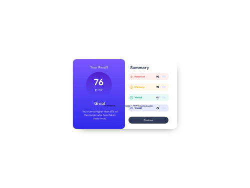
Design comparison
Solution retrospective
This is my part in the challenge. I look forward to ore review and doing a lot of project to improve my skills as a newbie in the tech world.
Community feedback
- Account deleted
I have a suggestion when it comes to best practices that you need to follow
- Never use a multiple <h1></h1> heading because this heading are supposed to be used once.
- on .sidesection {} classname that you defined replace all those <h1> into <span> because this element are the most suitable when it comes to non-semantics texts
Marked as helpful0 - @Kamlesh0007Posted over 1 year ago
Congratulations on completing the challenge! That's a great achievement, and I'm sure you put a lot of effort into it. I really liked the way you approached the challenge and the code you wrote. You demonstrated a good understanding of the concepts and applied them effectively to solve the problem.I have a few suggestions to improve your code further. You need to add Semantic HTML tags
The HTML structure should be semantically correct. The current structure doesn't provide any semantic information about the content. A better approach would be to use appropriate HTML tags such as <header>, <main>, <section>, <article>, etc. to define the sections of the page
here is the code that u need to add to add semantic tags in ur page
<body> <main> <div class="main-container"> ..... </div> </main> <footer> <div class="attribution"> Challenge by <a href="https://www.frontendmentor.io?ref=challenge" target="_blank">Frontend Mentor</a>. Coded by <a href="#">Richard Codes</a>. </div> </footer> </body> add border:none to button to make it as per design button { border:none; }
0
Please log in to post a comment
Log in with GitHubJoin our Discord community
Join thousands of Frontend Mentor community members taking the challenges, sharing resources, helping each other, and chatting about all things front-end!
Join our Discord