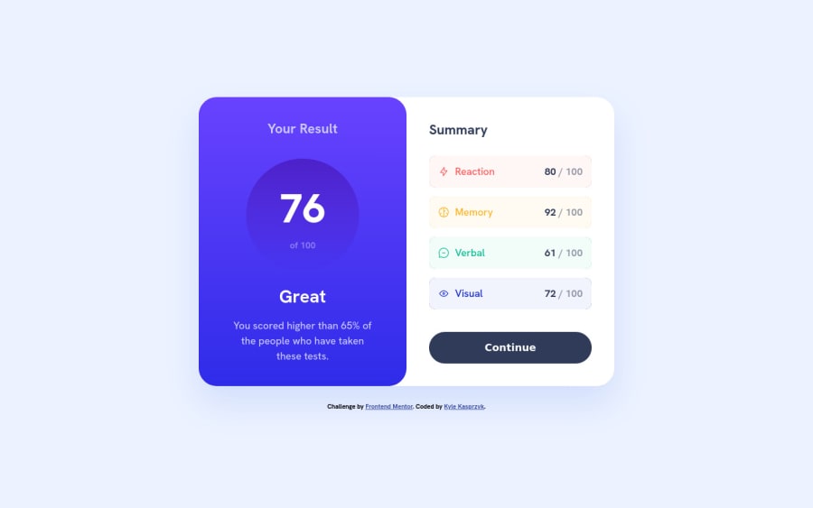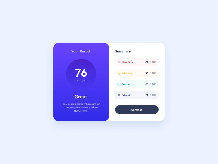
Design comparison
SolutionDesign
Solution retrospective
Hello 👋,
This is my solution for the results summary component challenge. 👨💻
I noticed the Figma design files have different text and background colors. I wasn't sure which to follow, so I blended the two.
I have a very basic understanding of Flexbox, and I'm excited to continue developing my skills with Flexbox.
Any tips on where to improve my work would be greatly appreciated.
Going to keep doing the challenges to improve my skills.
Thank you for taking the time to view my solution!
Community feedback
Please log in to post a comment
Log in with GitHubJoin our Discord community
Join thousands of Frontend Mentor community members taking the challenges, sharing resources, helping each other, and chatting about all things front-end!
Join our Discord
