Design comparison
Solution retrospective
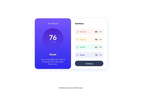
Had fun with this one, would love to implement more animations and interactions with JavaScript, but wanted to at least get the base done.
The style sheet for this feels really long, tried to organize it a bit, maybe could have condensed somethings.
Most of my unit sizing is done in absolutes with px units. Is that an acceptable practice in this day in age?
Community feedback
- @ApplePieGiraffePosted over 1 year ago
Hello, Henry Andrew Baum! π
Well done on this challenge! π
If your CSS file is becoming very long and harder to navigate, it may be worth looking into using a tool like Sass to make writing and managing your styles easier. Using Sass you can split your styles into smaller files for organization and do cool things like write simple "functions" to avoid repeating code.
It's a good practice to use ems/rems over pixels for font sizes for accessibility reasons. Here's a great article on the topic if you're interested in learning more about it. I'd also recommend using ems/rems for other the values of other properties in your CSS such as margin, padding, etc., as that will cause the rest of the design of your site to scale with the user's chosen default font size. π
As for your solution, I'd suggest leaving the
alt
text for the icons in the card component empty since they are mostly decorative and don't need to be read by screen readers.And don't forget to use a
button
element for the button in the card. πHope you find this helpful. π
Keep coding (and happy coding, too)! π
Marked as helpful1
Please log in to post a comment
Log in with GitHubJoin our Discord community
Join thousands of Frontend Mentor community members taking the challenges, sharing resources, helping each other, and chatting about all things front-end!
Join our Discord