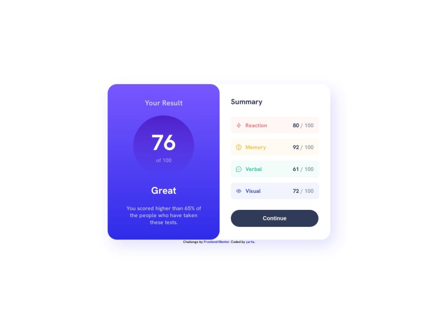
Design comparison
Solution retrospective
I used this challenge as an opportunity to begin my journey in learning to use Figma. Rather than subscribing to Pro to unlock the figma files, I recreated the component from scratch to the best of my abilities. Once I was happy with how it looked in figma, I used the developer mode to pull across measurements.
I learned that working in this way, whilst useful for comparison, is not perfect. Hard-coded pixel sizes for widths and heights can cause making the site responsive to be quite difficult. As such, I only coded the responsiveness to work for the suggested 375x809px mobile display without any other mobile resolutions in mind.
In future I would like to look at using ems, rems, and percentages along with figma to try and keep it as responsive as possible.
This was primarily a Figma learning experience - don't expect the CSS to be particularly well implemented!
Community feedback
Please log in to post a comment
Log in with GitHubJoin our Discord community
Join thousands of Frontend Mentor community members taking the challenges, sharing resources, helping each other, and chatting about all things front-end!
Join our Discord
