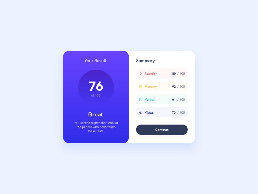
Design comparison
SolutionDesign
Solution retrospective
What are you most proud of, and what would you do differently next time?
I think I lack of a lot of "best practices". I think css code is messy as well
What challenges did you encounter, and how did you overcome them?I couldn't add a transition in the Continue button, also I think there are subtle UI bugs when shrinking the width of the windows
What specific areas of your project would you like help with?If you know how to avoid the button flickering when adding a transition property for the background linear gradient. Please let me now
Community feedback
Please log in to post a comment
Log in with GitHubJoin our Discord community
Join thousands of Frontend Mentor community members taking the challenges, sharing resources, helping each other, and chatting about all things front-end!
Join our Discord
