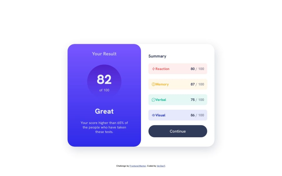
Design comparison
SolutionDesign
Solution retrospective
I had a small problem with the design on mobile devices and I’m not sure what the solution is. When testing on a device with a height resolution less than 667px (in this case an iPhone SE), the design is cut off and the Y overflow, and that doesn’t let me see the whole design. I couldn’t solve it, sorry :/
Community feedback
- @boris2912Posted over 1 year ago
Hi, try to remove the "height:100vh" that you applied to the main container. Hope it will be helpfull!!
Marked as helpful1@NVergilPosted over 1 year agoThanks for your feedback it whas very helpfull!! And for center my card I use grid istead flex c: @boris2912
0
Please log in to post a comment
Log in with GitHubJoin our Discord community
Join thousands of Frontend Mentor community members taking the challenges, sharing resources, helping each other, and chatting about all things front-end!
Join our Discord
