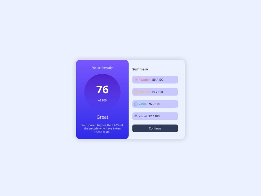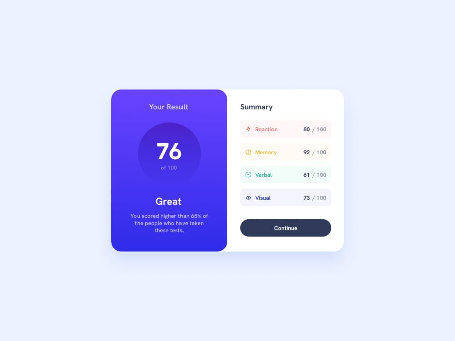
Design comparison
SolutionDesign
Please log in to post a comment
Log in with GitHubCommunity feedback
- P@developer-ruben
Hi!
Here are my tips and tops on your component:
- Great use of custom properties!
- Try using methods like BEM to better organise your classes
- Avoid pixels for font sizes, this makes that when a user adjust his/her browser settings to a larger font, this wont have effect on your component
- use the 'section' html element for the base tag of your component, this improves accessibility and readability
Cheers! Ruben
Join our Discord community
Join thousands of Frontend Mentor community members taking the challenges, sharing resources, helping each other, and chatting about all things front-end!
Join our Discord
