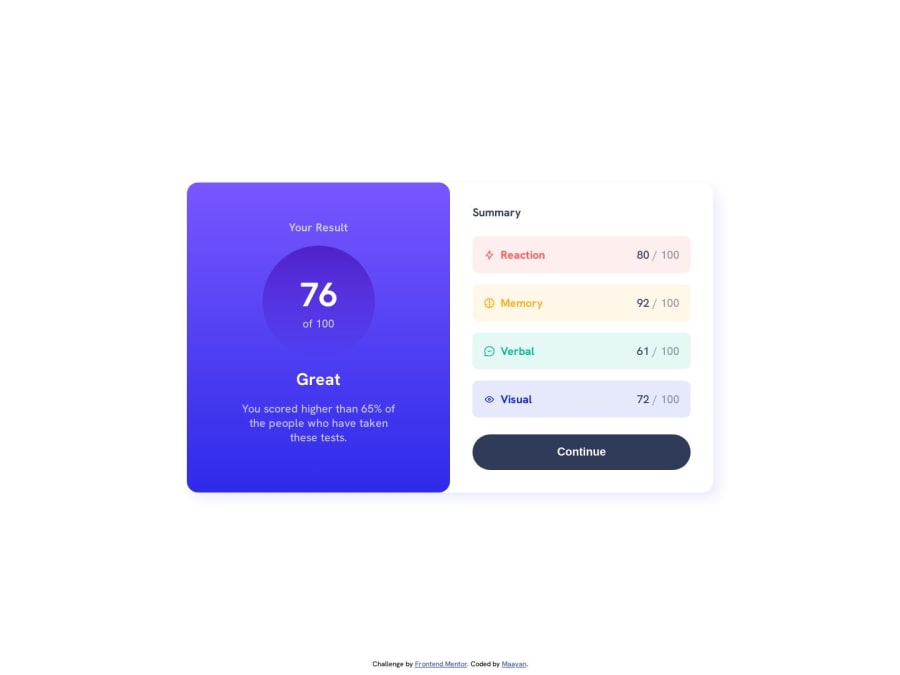
Design comparison
Solution retrospective
Hi there 👋
My solution for this challenge:
using data.jason (JSON file)
Feedback is welcome 😊
Community feedback
- @BlackpachamamePosted 11 months ago
It looks great on you maym42! The design looks perfect, I can only mention an accessibility issue regarding the icons. For this case, since they are only icons and they are only decorative images, I recommend using an empty alt text
alt="". To tell assistive technology to ignore an image. More infoMarked as helpful1 - @danielmrz-devPosted 11 months ago
Hello @maym42!
Your solution looks great!
I have a suggestion for improvement:
- For semantic reasons, replace your
div.cardwithmain.cardand use HTML headings (h1 to h6) for the titles.
The
<h1>to<h6>tags are used to define HTML headings.<h1>defines the most important heading.<h6>defines the least important heading. Only use one<h1>per page - this should represent the main heading/subject for the whole page. Also, do not skip heading levels - start with<h1>, then use<h2>, and so on.All these changes may have little or no visual impact but they make your HTML code more semantic and improve SEO optimization as well as the accessibility of your project.
I hope it helps!
Other than that, great job!
Marked as helpful0 - For semantic reasons, replace your
Please log in to post a comment
Log in with GitHubJoin our Discord community
Join thousands of Frontend Mentor community members taking the challenges, sharing resources, helping each other, and chatting about all things front-end!
Join our Discord
