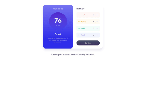
Submitted over 2 years agoA solution to the Results summary component challenge
Results summary component
@Felix221123

Solution retrospective
I learnt the use linear-gradient to set different color varieties dependng on the percentage level and which elements does not accept linear-gradient as their values. The difficult part to me was setting the right hsla and getting the right linear gradient to match the design. Overall this project was fun and I learnt a lot along the way : )
Code
Loading...
Please log in to post a comment
Log in with GitHubCommunity feedback
No feedback yet. Be the first to give feedback on Felix's solution.
Join our Discord community
Join thousands of Frontend Mentor community members taking the challenges, sharing resources, helping each other, and chatting about all things front-end!
Join our Discord