Not Found
Not Found
Not Found
Not Found
Not Found
Not Found
Not Found
Not Found
Not Found
Not Found
Not Found
Not Found
Not Found
Not Found
Not Found
Not Found
Not Found
Not Found
Not Found
Not Found

Submitted

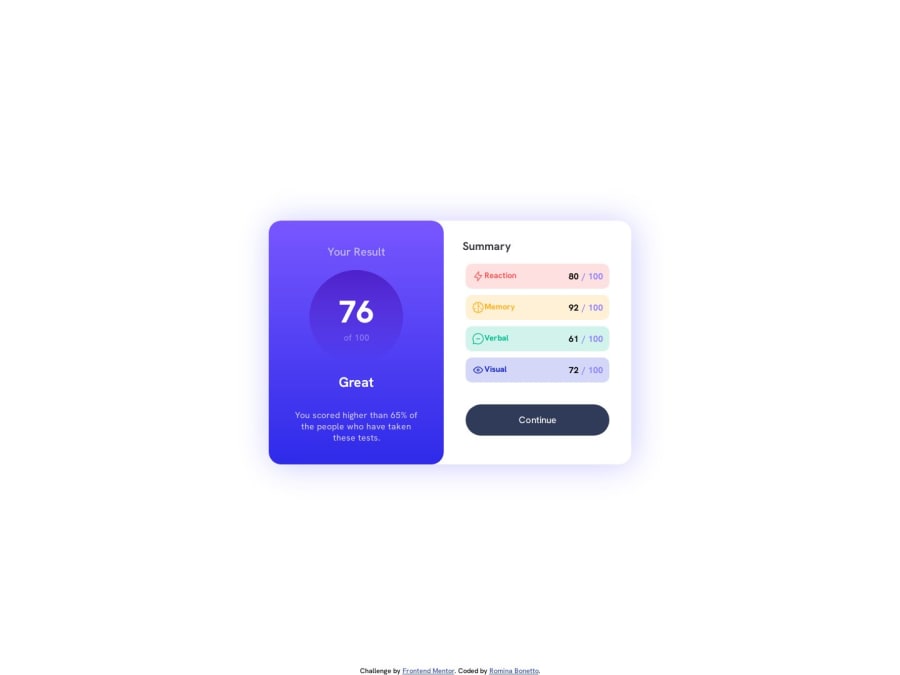
Results Summary challenge using HTML and CSS

Romina Bonettoβ€’ 20

@Romina-Bonetto

Desktop design screenshot for the Results summary component coding challenge

This is a solution for...

  • HTML
  • CSS
1newbie
View challenge

Design comparison


SolutionDesign

Solution retrospective


It took time but I think it ended up pretty well. I learned new things such as the gradient color usage. I didn't know how to use the .json to show the information. I'll keep practicing.

Community feedback

Alexandre JOLIETβ€’ 170

@alexandre-joliet

Posted

Hello Romina πŸ‘‹!

Congratulations for finishing this challenge!

Additionnaly to what have been said above, here are some others tips:

  • Try to not specify a max-width to your body. By doing so, you will always have your element centered in the screen, no matter its dimension. You can test it very easily by using the Inspect mode (F12 key on Chrome) and unticking the max-width box in the body part.

  • Avoid to use multiple h1elements in the same page for this challenge. I'm not an expert yet on Accessibility, but what I understood is that screen readers will look in priority to these elements when loading a page to enumerate these titles. Having multiples ones and/or using them for non "real" titles elements can cause confusion for the user at the end. Maybe others elements will be more relevant to use here.

  • I'm not sure the align-self in your left_container has a particular use here (no effect when I've removed it in my test).

Happy coding!

Marked as helpful

1

Romina Bonettoβ€’ 20

@Romina-Bonetto

Posted

@JojoRider excellent tip about max-width in body. Thanks!!

0
Abdul Khaliq πŸš€β€’ 72,660

@0xabdulkhaliq

Posted

Hello there πŸ‘‹. Congratulations on successfully completing the challenge! πŸŽ‰

  • I have other recommendations regarding your code that I believe will be of great interest to you.

POINTING CURSOR ↗️:

  • Looks like the component's button element has not a pointer, this property plays a major-role in terms of both UI & UX
  • The cursor: pointer CSS property is important for button-like elements because it changes the cursor from the default arrow to a pointer when hovering over the element. This provides a visual cue to the user that the element is clickable and encourages interaction.
  • In terms of UI/UX, using cursor: pointer helps to improve the usability of the interface by making it easier for users to identify interactive elements. It also helps to provide feedback to the user by indicating which elements are clickable and which are not.
  • So we want to add this property to the following continue button element
.button {
cursor: pointer;
}
  • Now your component's button has got the pointer & you learned about this property as well

.

I hope you find this helpful πŸ˜„ Above all, the solution you submitted is great !

Happy coding!

Marked as helpful

1

Romina Bonettoβ€’ 20

@Romina-Bonetto

Posted

@0xAbdulKhalid I appreciate the tip Abdul. Will modify this property.

0
Fernando Bentoβ€’ 180

@Fernando-Bento

Posted

Hello! πŸ‘‹

I would like to take this opportunity to share a suggestion that I believe would be extremely beneficial for your website. It would be a great idea to add a media query to the div with the name "left_container" and set the value of flex-direction: column.

By incorporating a media query, you would have the ability to adapt the layout of the site based on the screen size of the device it is being viewed on.

The "mobile first" approach is highly recommended as it prioritizes design and functionality for mobile devices, which are increasingly used to access the web. By setting flex-direction: column on the "left_container" div, you would ensure that the elements are displayed vertically, providing a more intuitive and user-friendly viewing experience for mobile devices.

This approach not only improves the usability of your site on smartphones and tablets but also establishes a solid foundation for expanding and adapting the layout for larger devices.

I believe that implementing this suggestion would bring significant improvement to your site, offering a consistent and enjoyable experience across all screens.

Thank you for your attention and ongoing dedication to enhancing your website! πŸ’ͺ✨

Marked as helpful

1

Romina Bonettoβ€’ 20

@Romina-Bonetto

Posted

@Fernando-Bento thank you Fernando for the suggestion. I'm really insterested on learning web responsiveness and usability. I'll look into media queries.

1

@Kamlesh0007

Posted

Congratulations on completing the challenge! πŸŽ‰.That's a great achievement, and I'm sure you put a lot of effort into it. I really liked the way you approached the challenge and the code you wrote. You demonstrated a good understanding of the concepts and applied them effectively to solve the problem.I have a few suggestions to improve your code further. You need to add hover effect on button as per design. Here's an example code snippet:

.button :hover
{
background: linear-gradient( 252, 100%, 67%,  241, 81%, 54%);
}

Marked as helpful

1

Romina Bonettoβ€’ 20

@Romina-Bonetto

Posted

@Kamlesh0007 thank you for the suggestion! I'll try it.

0

Please log in to post a comment

Log in with GitHub
Discord logo

Join our Discord community

Join thousands of Frontend Mentor community members taking the challenges, sharing resources, helping each other, and chatting about all things front-end!

Join our Discord