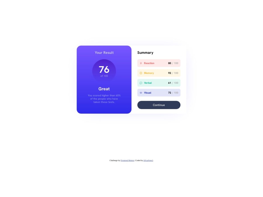
Results Summary Challenge using CSS Grid and Flexbox
Design comparison
Solution retrospective
For this challenge I used a 2-column grid layout - "Your Results" in column 1 and "Summary" in column 2.
Your Results:
I used a mix of h1, h2 and p elements for all the text. I wasn't too worried about matching the colors exactly but I think I got it pretty close. For the score, "76 out of 100", I actually placed those in a flex container with the direction set to column. I feel like this let me easily position them inside the element, which I added some padding, and border radius, along with the gradient background.
Learning moment: I couldn't get the spacing between 76 and 100 exactly how I wanted. I spent some time playing with gap (because they are two items in a flex container), and had no luck. My "A-ha!" moment was when I remembered the line-height property. I couldn't understand why the box height was larger than the text that was inside of it (in dev tools, Chrome, this is the blue box overlay). That's because a text element has a default line-height set by the browser, if you don't set it yourself. I simply changed the line height and was able to bring the two lines closer together as I intended.
The rest of the section was just padding around the outside, and margin-bottom on each element for spacing inside the container.
Summary:
This one was a little more involved. Each category (Reaction, memory, etc.) was built using a series of flex containers. The first being a flex container that held every category in it, set to display: column.
Next, each category has a flex container inside it with two items "category-left" (icon + Category title) and "category-right" (score total / 100), separated using the space-between property.
category-left and category-right are also flex containers, mostly to take advantage of the align-items property and gap.
The "Continue" button is a block level element with padding, color, border-radius and margin to match as closely to the example as I could, but I wasn't worried about pixel-perfect. I chose block-level for this element because it automatically filled the width of the container and matched the width of the categories without having to play with it.
This comment section describes how I chose to code this challenge. I appreciate any feedback you might generate based on my comments.
Community feedback
Please log in to post a comment
Log in with GitHubJoin our Discord community
Join thousands of Frontend Mentor community members taking the challenges, sharing resources, helping each other, and chatting about all things front-end!
Join our Discord
