

Design comparison
SolutionDesign

Solution retrospective
What are you most proud of, and what would you do differently next time?
I am proud because I managed to do the mobile view without any assistance. The design is almost or the same with the figma design.
What challenges did you encounter, and how did you overcome them?The desktop design almost made me cry lol, but I tried my best.
The challenge I have is that my button text is not turning white.
What specific areas of your project would you like help with?-
My button text is not responding to the color set to white.
-
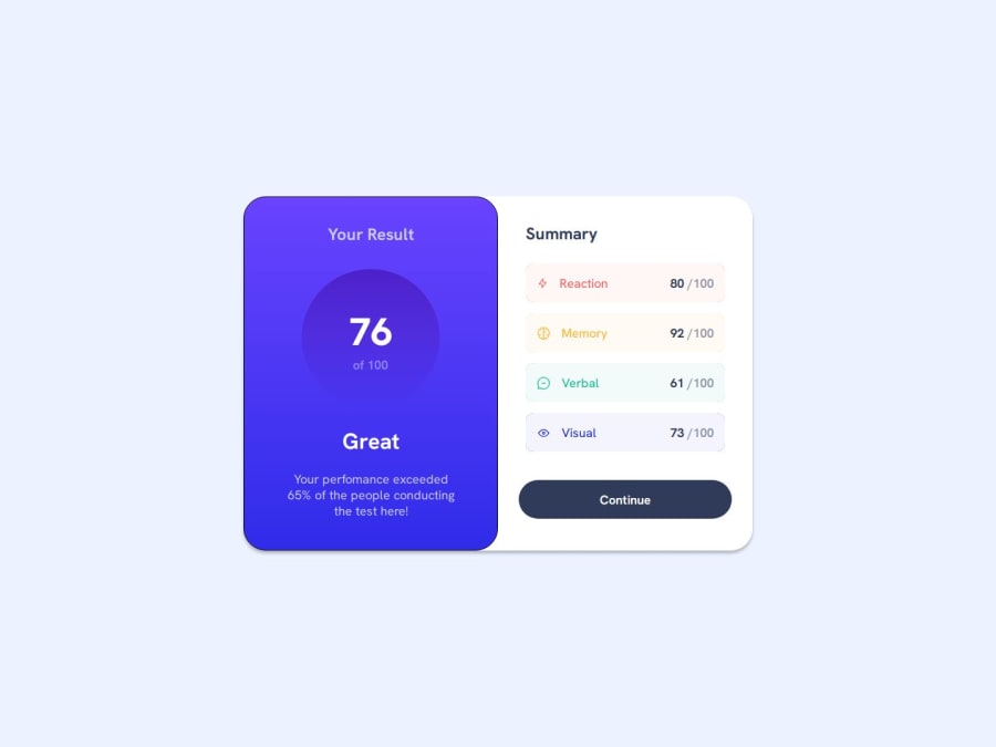
And this text (Your performance exceed 65% of the people conducting the test here!) in the desktop design is slightly bigger.
Community feedback
Please log in to post a comment
Log in with GitHubJoin our Discord community
Join thousands of Frontend Mentor community members taking the challenges, sharing resources, helping each other, and chatting about all things front-end!
Join our Discord