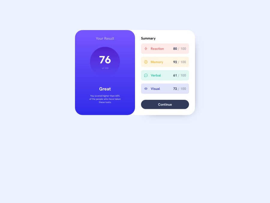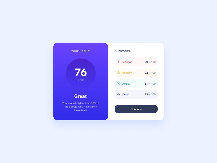
Design comparison
SolutionDesign
Solution retrospective
What are you most proud of, and what would you do differently next time?
Really just came across making a circle you want to set the width and the height. Stacked some divs inside divs applying flex to them. While it wasn't as natural as I would like, there was definetely some comfort there.
What challenges did you encounter, and how did you overcome them?I feel like my workflow has become more regimented and organized. I also think my code is mostly organized. I would love to see what are some industry practices that I can implement to take it to the next level.
What specific areas of your project would you like help with?Any feedback is always welcome.
Community feedback
Please log in to post a comment
Log in with GitHubJoin our Discord community
Join thousands of Frontend Mentor community members taking the challenges, sharing resources, helping each other, and chatting about all things front-end!
Join our Discord
