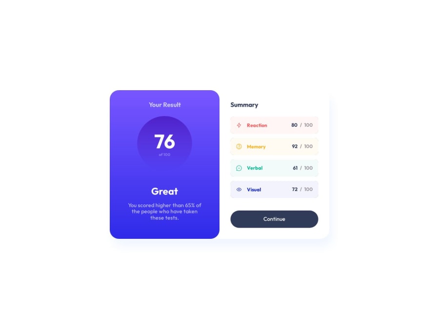
Design comparison
SolutionDesign
Solution retrospective
- Used em and rem quite irresponsible. Probably should've used
remonly and think if I needem. - Implementation of partial borders for an category item are "borrowed" from here. But the suggested implementation needed a tweak as without any changes borders won't have the same width and height. I fixed it in kinda "hacky" manner because changing the height of bottom borders will render it at wrong place so I fixed it by setting negative
top. - By the way, I would love to implement those border without adding these addition two divs for every category for sake of readability. I thought of using pseudo elements but you can't create that much with them. Need to see how other people implemented it.
- Without using any css preprocesses such as SASS the naming become the problem. I'd like to use "self explanatory" style names but it hurts html readability. The same thing applies to css: even with such a small project the wall of styles make it hard to move.
- Especially when I had to create a hacky partial borders as it creates a small wall of utility css. Not sure how to handle it but I started appreciated scoped styles more than ever.
- BEM looks good in theory but that "__" everywhere hurts my eyes.
Community feedback
Please log in to post a comment
Log in with GitHubJoin our Discord community
Join thousands of Frontend Mentor community members taking the challenges, sharing resources, helping each other, and chatting about all things front-end!
Join our Discord
